I was working on a post describing the cancer mortality trends in Minnesota, which is a bit complex. It makes sense to split the first part off into its own article, so here you go.
The point of this article is to present the bird’s eye view of overall mortality in Minnesota, and to highlight a few of the important confounders that skew the topline total numbers to misrepresent the underlying reality.
I. Total Deaths
First we will look at a few stats about deaths from all causes (usually referred to as “All Cause Mortality”)
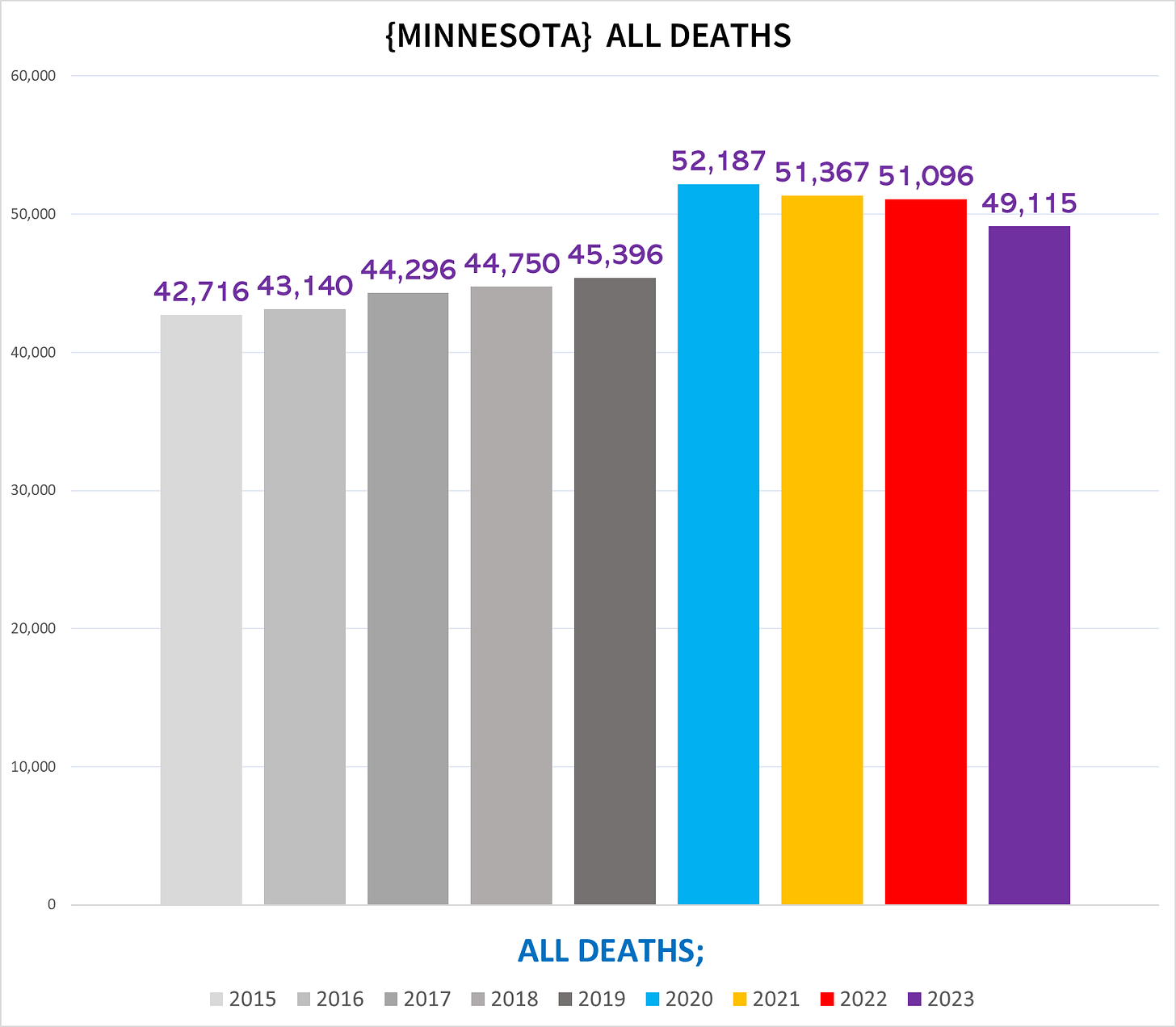
The following chart shows the total # of deaths each year in MN1:
You can see that starting in 2020 there is a lot more deaths compared to previous years. This trend continues for all years after 2020 so that we are still today suffering from excess mortality.
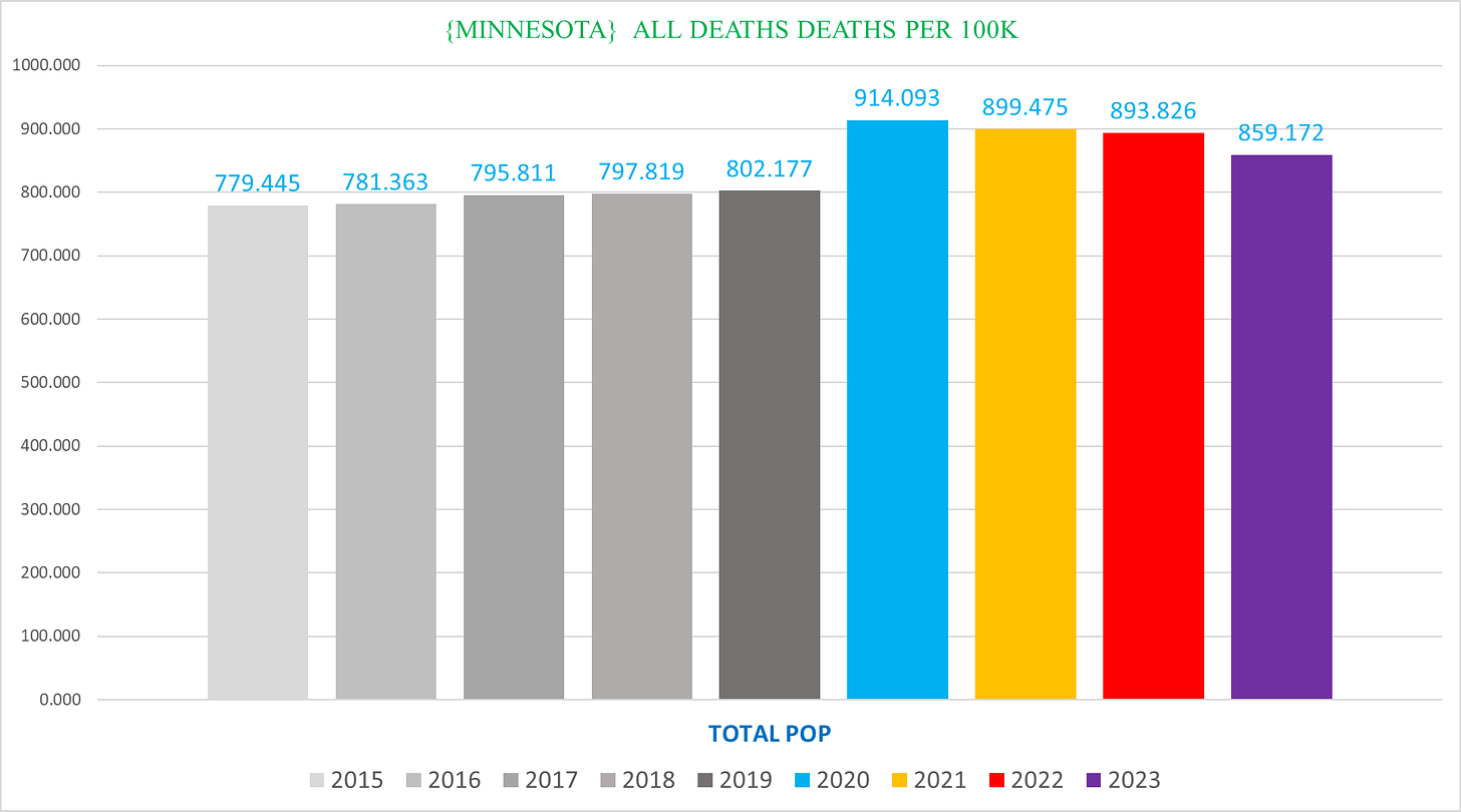
This trend remains when we adjust for population growth, which you can see in the following chart showing the *# of deaths per 100K people* in MN:
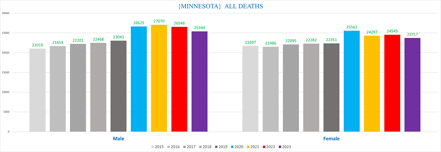
This trend is manifest regardless of sex:
We can conclude even from just the topline numbers that there’s definitely more people dying than we would expect starting in 2020 and continuing through today.
Other Stats
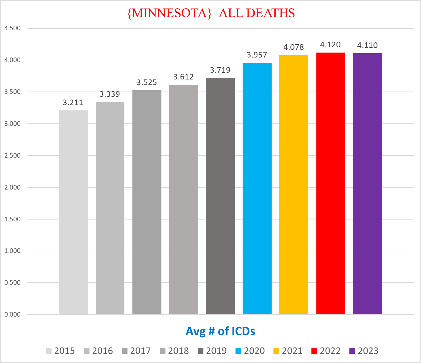
Average # of ICD codes on the death certificate
The vast, vast majority of people who die have multiple Causes of Death documented as contributing to the death (see here for more). Each one gets assigned the ICD code corresponding to that condition. The following chart shows the average # of ICD codes on each death certificate:
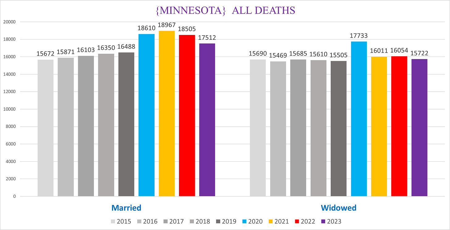
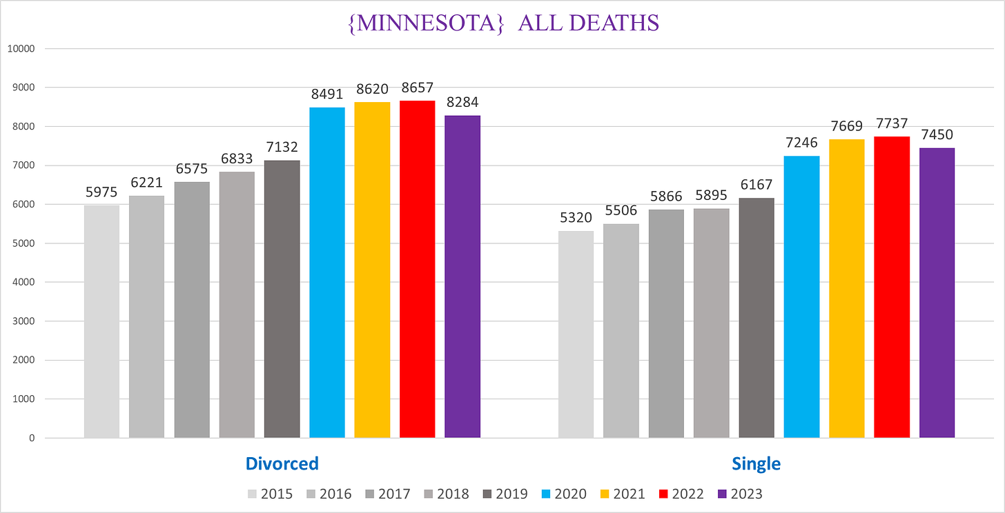
Marital Status
There are a few conditions where there are big differences in trends between these categories, but not so much in the ACM, with the exception of widowed being a partial proxy for nursing home residents:
(I left the other/unknown off because there are so few of them.)
Average age of death
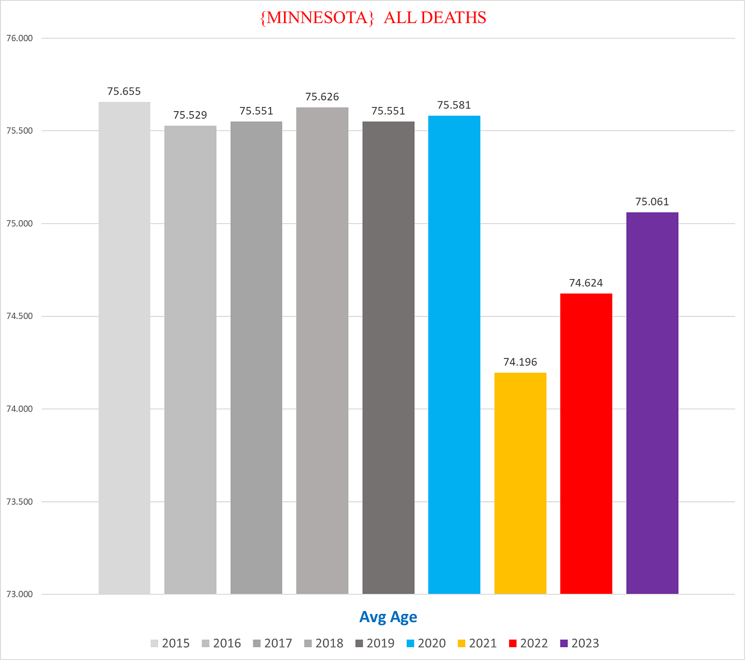
There’s one stat that even in the combined all-cause mortality is bizarre - the average age of the decedent, visualized by the following chart:
The average age of deaths dropped almost a year and a half. This is actually a massive drop even if it superficially may not sound like much. To move the average age down by such a margin, you need a *lot* of extra deaths in young people to balance out the octogenarians and septuagenarians who comprise the overwhelming majority of deaths each year, as we’ll see later when we look at distinct age groups.
This dramatic shift is a good signal that the driver of excess mortality changed between 2020 & 2021.
II. Simpson’s Paradoxes
One of the biggest confounders of data is something called “Simpson’s Paradox”. Basically it’s when the subsets of a group cancel each other out into an average that hides the differences in each subset.
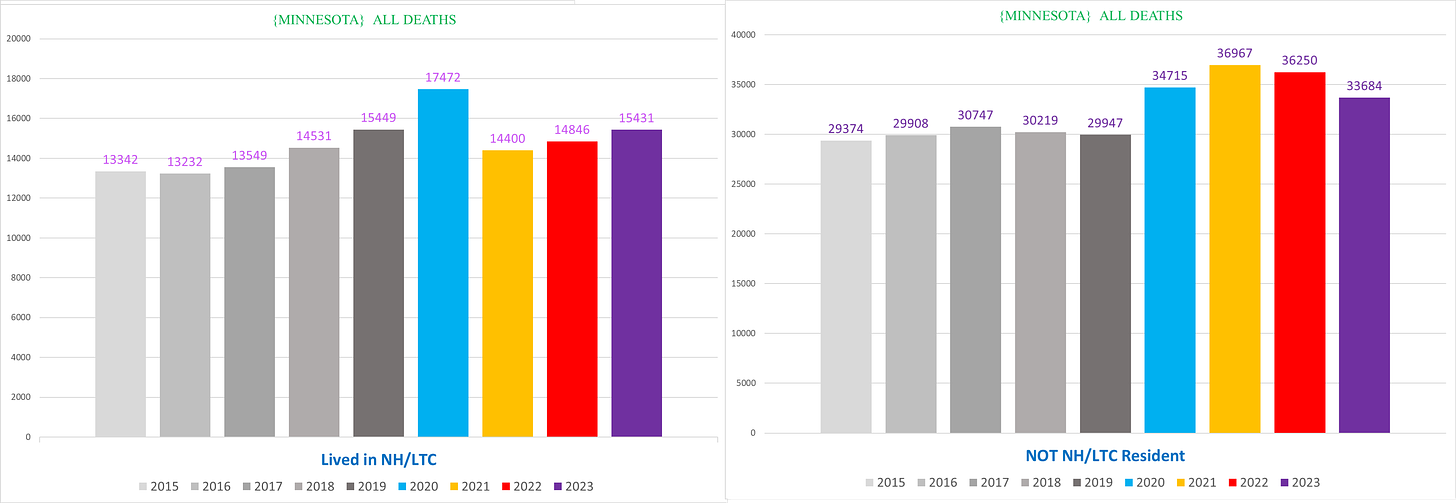
There’s one *massive* Simpson’s Paradox in the mortality data that is relevant in almost every condition that we’ll use to illustrate: Nursing Home / Long Term Care residents vs the non-NH/LTC resident population.
The following chart shows deaths from the NH (left) vs non-NH (right) populations side by side:
The number of deaths per year actually go *DOWN* - quite substantially - in the NH population after 2020. Conversely, the number of deaths in the non-NH population goes up in 2020, but then even more in 2021, and stays elevated above 2020 in 2022.
But when you combine them into a single group of ‘everyone who died’, the sharply contrasting trends blend into a trend that averages them both, which we saw in the first chart above that makes it look like the excess deaths peaked in 2020 and then went down from there:
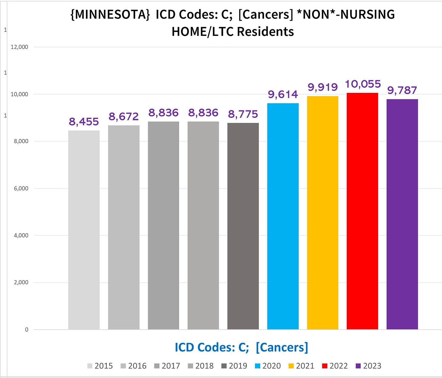
This particular paradox becomes far more critical and disruptive when it comes to certain conditions, such as cancers.
Age
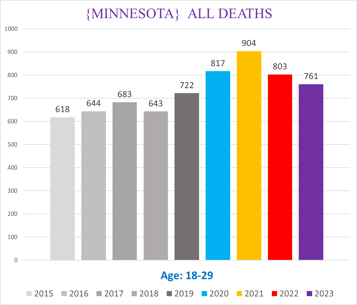
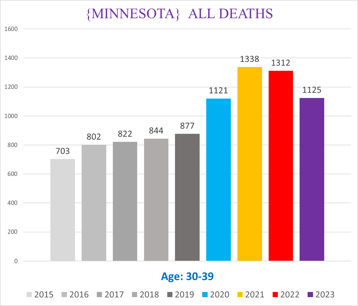
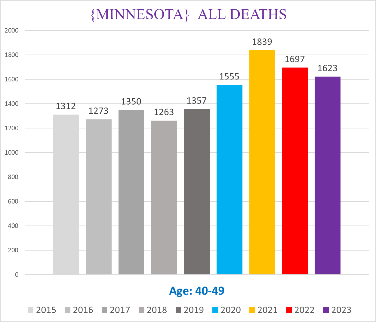
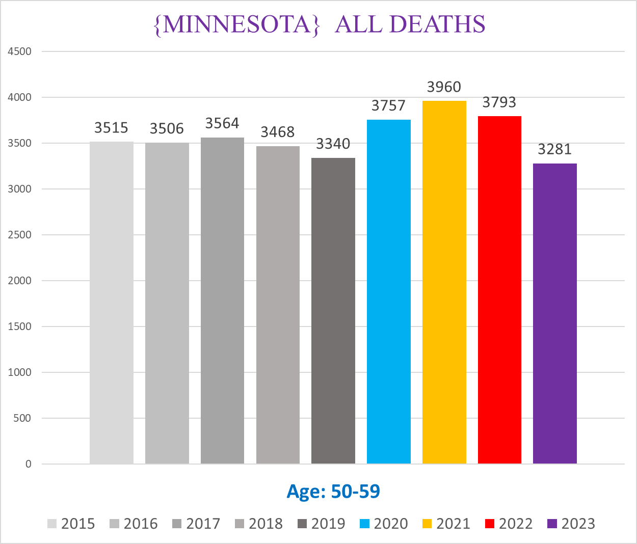
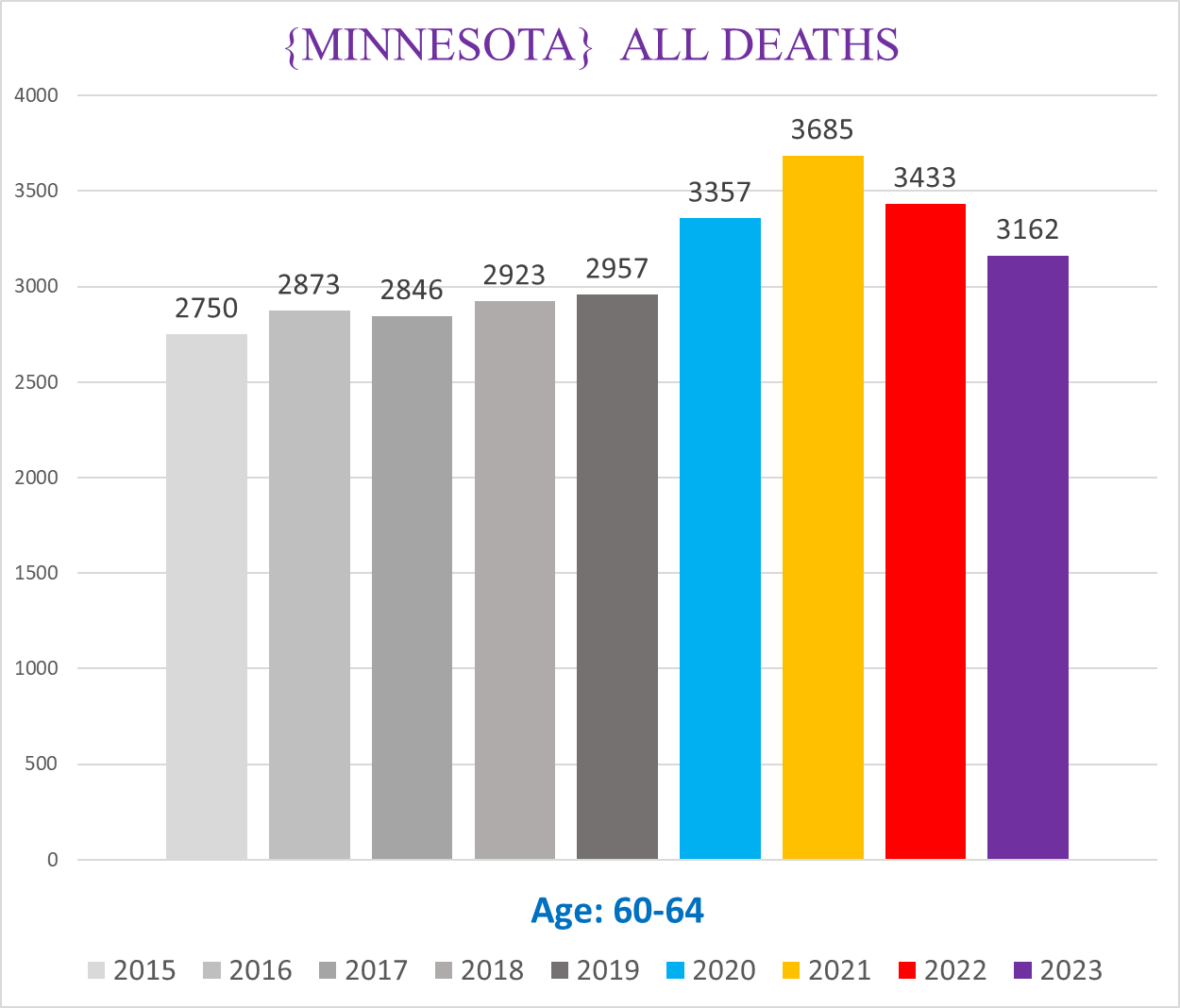
Age cohorts pose another Simpson’s Paradox, where the cumulative total swamps out strong signals in younger age cohorts because there are >100x as many deaths in seniors as in teens.
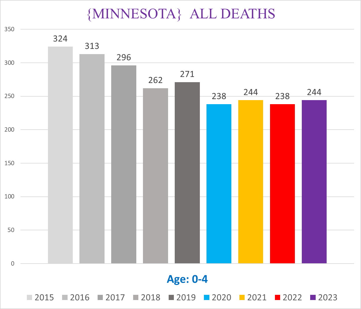
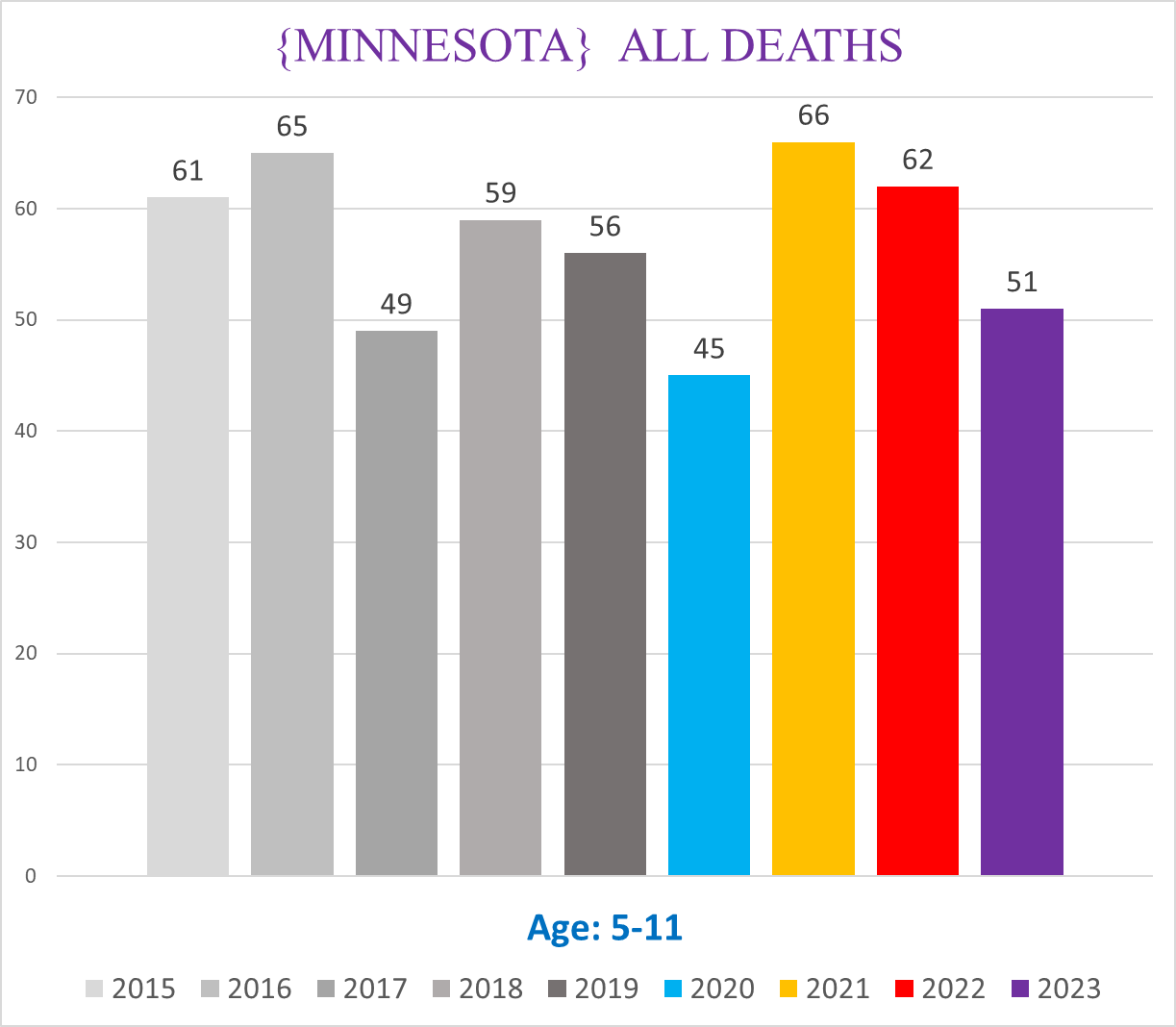
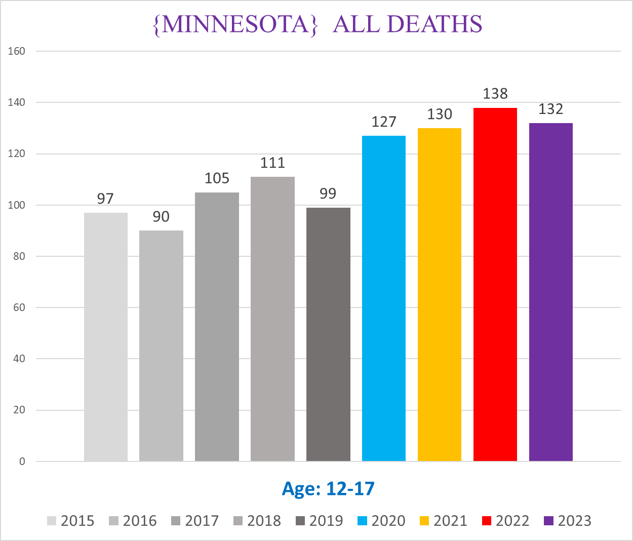
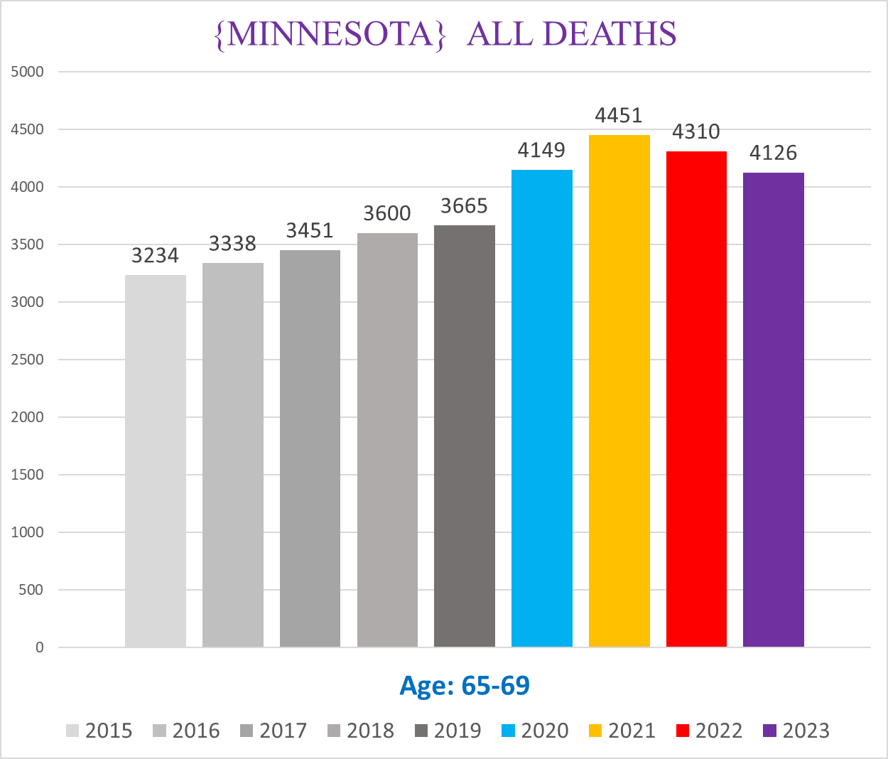
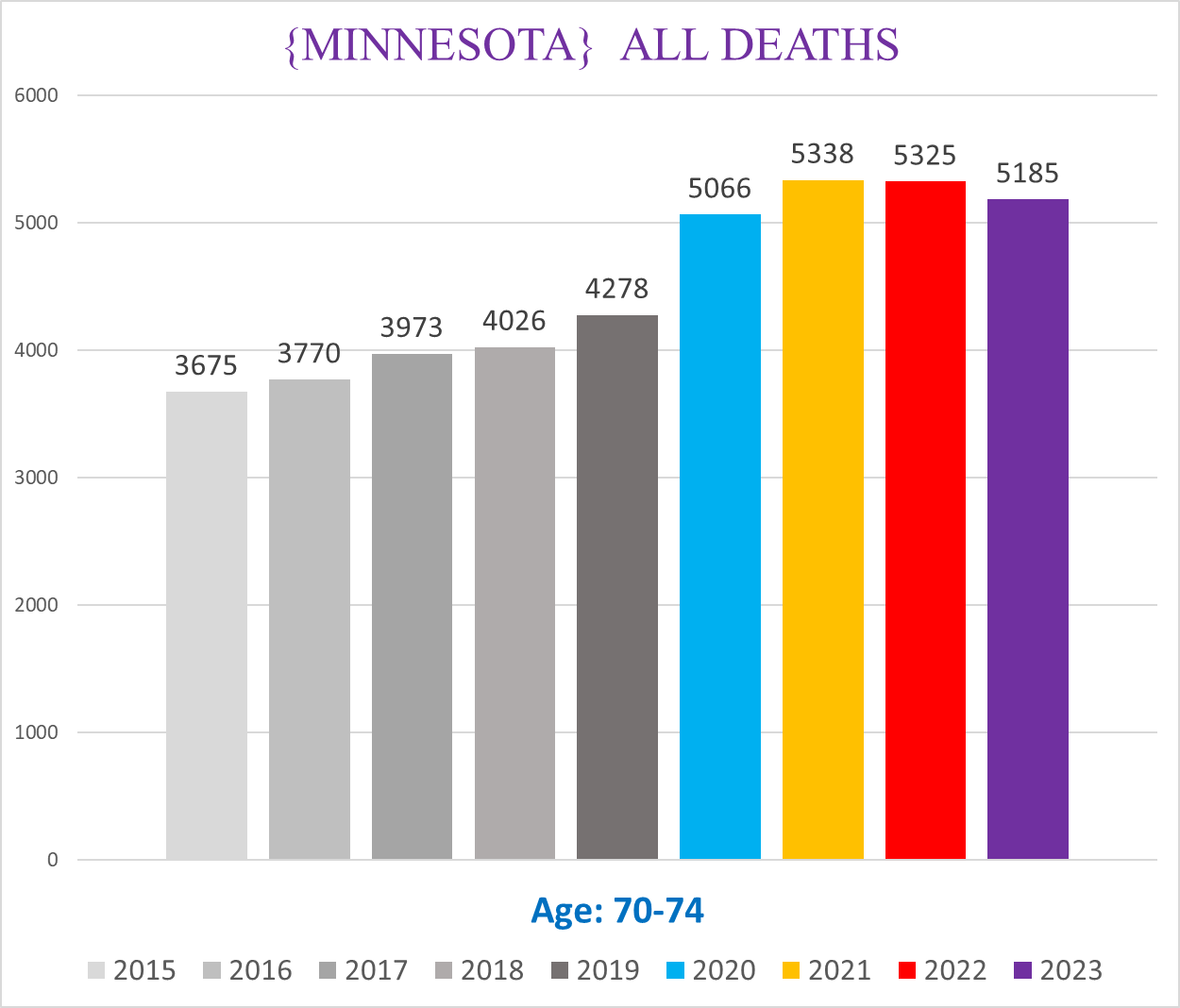
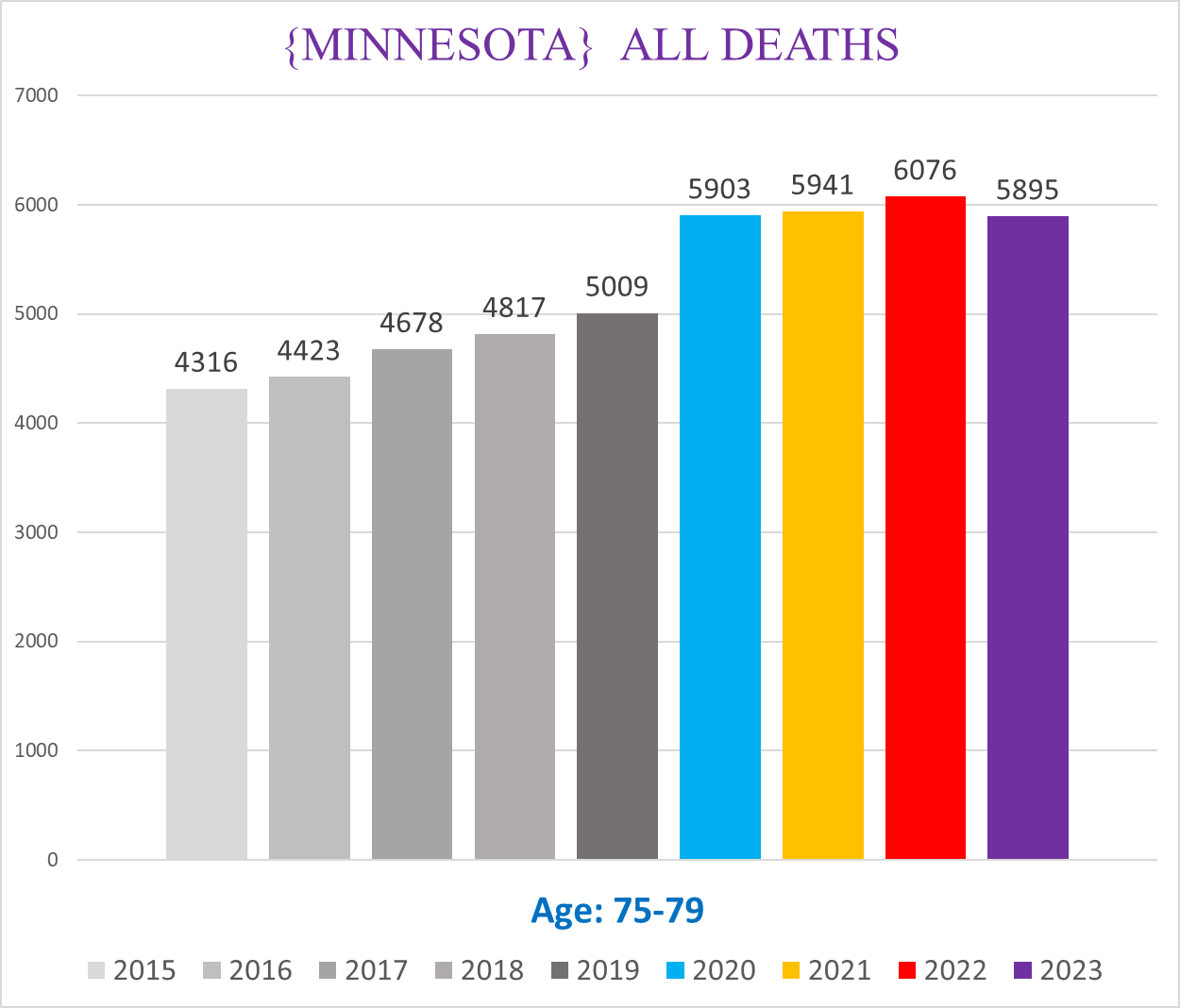
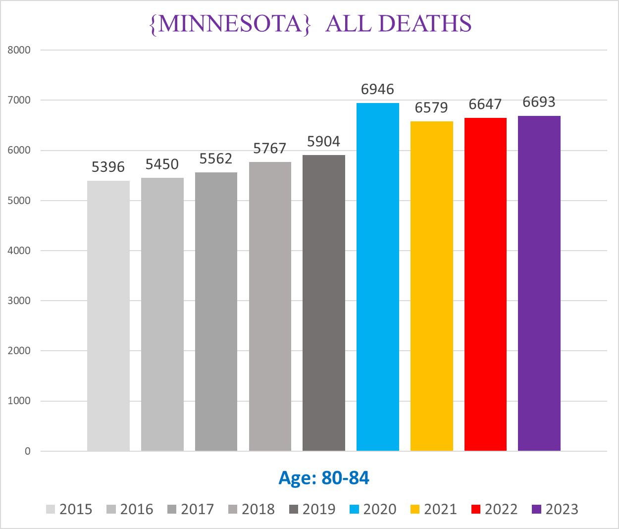
The following charts show all cause mortality for each age cohort.
Ages 0-4:
Ages 5-11:
Ages 12-17:
Ages 18-29:
Ages 30-39:
Ages 40-49:
Ages 50-59:
Ages 60-64:
Ages 65-69:
Ages 70-74:
Ages 75-79:
Ages 80-84:
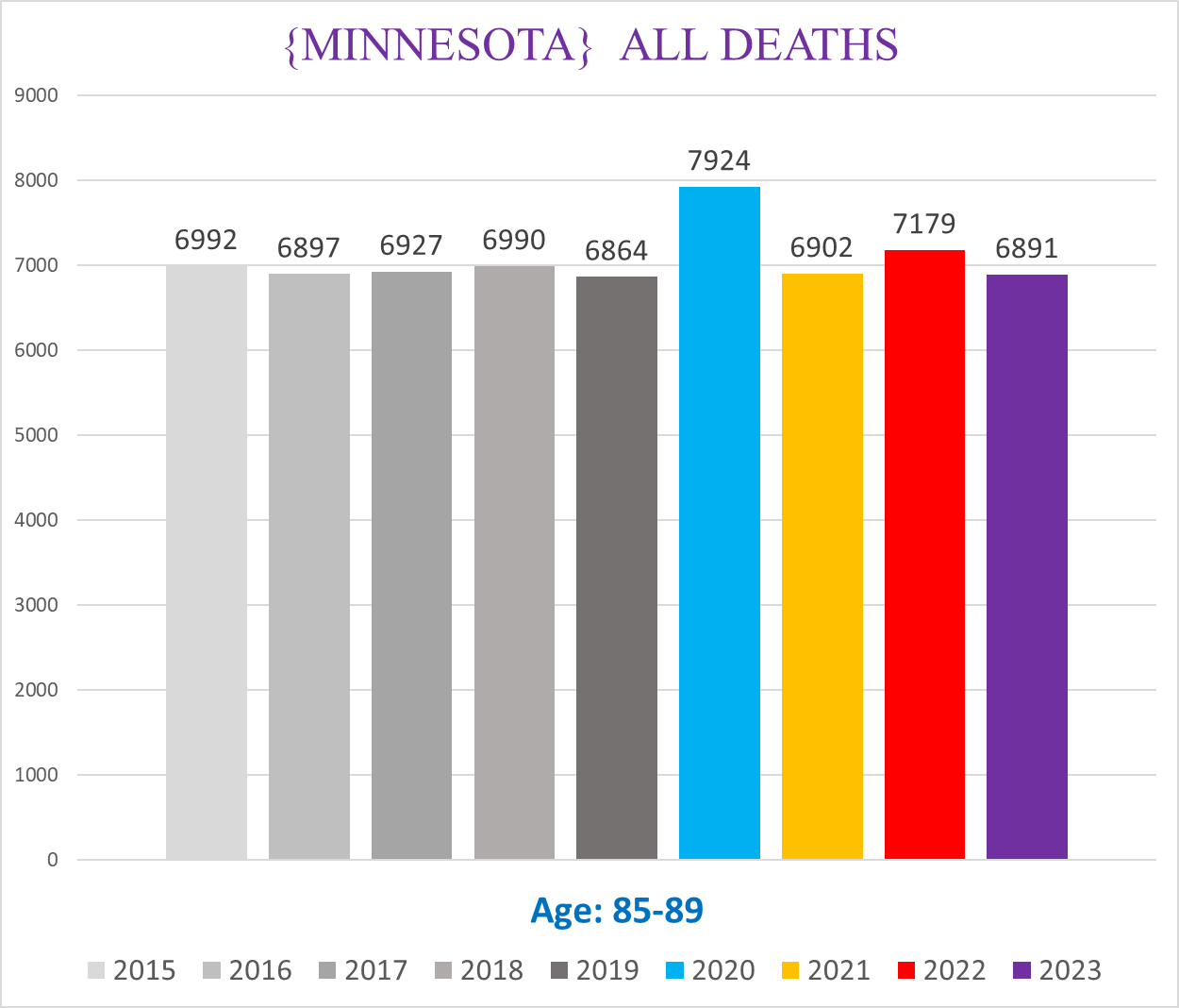
Ages 85-89:
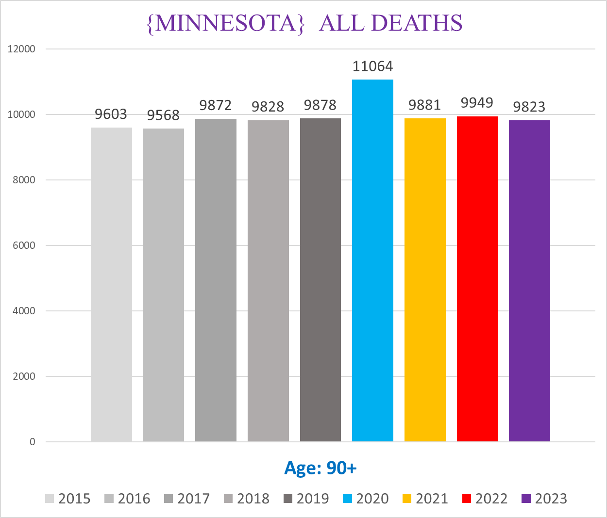
Ages 90+
‘Pull Forward Effect’
Notice in the last two charts showing the deaths for 85-89 & 90+ year old’s, there doesn’t seem to be any excess death after 2020, rather the number of deaths seems to return to normal.
This however is an illusion. After the substantial excess mortality in 2020, in 2021 we should see a mortality deficit - i.e. lower than normal - because a substantial % of the excess deaths in 2020 were people who were otherwise going to die in 2021. (How many of those deaths were “stolen” from 2021 is a good question, and has no definitive answer, although honest competent experts can create mathematical models to give an approximate range where the number is likely to be.)
*************
Next article will start to address cancer mortality in Minnesota, which should be a bit more exciting than this one.
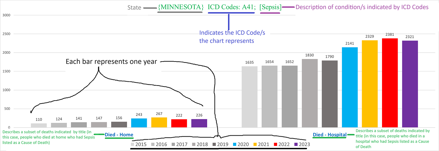
How to read the charts
--each chart has a title on top that describes the parameters or conditions of the deaths shown by the chart
--each bar represents the tally for one year
--the various shades of grey bars are for the years 2015-2019 (left to right)
--blue bar = 2020
--yellow bar = 2021
--red bar = 2022
--purple bar = 2023
--the number on the top of each bar indicates the number of deaths in that year that fit the conditions articulated in the title of the chart


Several points I'd like to make:
1) lots of nursing home residents were killed off with the jab. This is confirmed by whistle-blowers such as nurses, embalmers etc.
2) Back in 1970s, my husband worked at Public Health Dept. in PA. He helped to develop jabs. He learned then that cancer cells were being put into the jabs. That's when he quit developing jabs and never had another one. Later a book came out called "Dr. Mary's Monkey". I highly recommend everyone read that book. It also mentions that cancer cells are in jabs but has A LOT of other important info.
3) Then there's news which has come out saying finally) that chemotherapy kills: https://thepeoplesvoice.tv/new-study-finds-chemotherapy-causes-widespread-cell-cannibalism-and-death/
4) It has been found that fenbendazole along with ivermectin will kill most cancers. You can buy both quite cheaply on Amazon. Look up dosage etc. Also essiac is a blend of 4 herbs which kills cancer/tumors. I know this for a fact because a friend's mom had a grapefruit-sized tumor in her bowels. My friend saw the x-ray of her mom's tumor. She started a month long course of essiac in tea form and one month later x-ray showed tumor was entirely gone. Sadly, she died a short while later of her third course of chemotherapy. Baking soda will also kill cancer cells as those cells can't live in an alkaline environment, which baking soda creates. There is a book on this by Dr. Sircus, a naturopath.
So I'm not surprised that folks are dying in retirement homes and many young folks are getting cancer and dying. They have found a way to ramp up the time that it takes to die from cancer now, too. It no longer takes a year or even 6 months. I've read that there are folks who die of cancer after they get the jab before they can even get to a doctor for treatment. This is what Dr. Fauci and his cohorts created and it's Crimes Against Humanity; makes the Nazis look like amateurs IMO.
Excellent info. The 2020 excess deaths were all among the old - nursing home residents dying from iatrogenic protocols. The huge spike in deaths - in almost all age categories - in 2021 and 2022 were vaccine-caused deaths.