Vermont's Post-Pandemic Mortality Apocalypse
Analysis of Vermont Death Certificates Reveals Stunning Excess Mortality Increases from a Variety of Conditions in 2021 & 2022 - including COVID - but not so much in 2020
I obtained from the state of Vermont the death certificates for all deaths that occurred in the state for the years 2015-2022 (through 10/26). Although we are just beginning to sift through the data, we have some preliminary deeply concerning observations that are inconsistent with claims of both vaccine safety and efficacy.
I am deeply indebted to John Beaudoin for organizing the data and putting together the charts and graphs below. For those who do not know, he is the fellow who obtained the death certificates from Massachusetts and used that data to demonstrate that there is a considerable amount of excess mortality associated with the covid vaccines. He has filed a lawsuit in MA alleging widespread deliberate fraud in order to inflate the covid death toll but disguise the deaths caused by the covid vaccines (and other policies like the use of Remdesivir).
John wrote a series of articles on his substack Coquin de Chien explaining the MA data. He also has a website documenting his lawsuit where you can find all of the documents involved in the lawsuit. He has also given a number of presentations explaining the MA data, including here, here, and here.
What we should have observed if the mainstream narratives about covid and the vaccines were correct
We were admonished - repeatedly and incessantly - how covid was the Black Plague Redux. We were also instructed that the only way to break the back of covid morbidity and mortality was by way of the covid vaccines; vaccines that we were counseled were completely, 100% safe.
Vermont is probably the most heavily vaccinated state in the US. Vermont achieved 95% vaccination in non “BIPOC” seniors 65+ by September 2021 (the population of Vermont is 93.6% White according to Google).

If these premises were true, then we should expect to see the following:
significant excess mortality that is readily apparent to anyone looking at even the simple topline number of deaths. If covid was truly a doomsday scenario come to life, then we would see the obvious hordes of extra dead people.
significantly *lower* mortality after the vaccines are rolled out - if covid is a massive killer that could only be solved by vaccines and not anything else, then we should see lots of extra deaths until the vaccines are rolled out, and sharply reduced deaths after the vaccines are rolled out.
significantly lower mortality from the conditions associated with covid - e.g. if covid causes an increase in deaths from cardiac conditions, there should be less cardiac associated deaths after the vaccines when covid has been neutered than before the vaccines when covid had free reign to rampage about the population.
It is important to emphasize that there are plenty of other factors that influence population mortality besides for covid disease and the covid vaccines. The argument here is *not* that if the establishment narrative was correct, then there should be a perfect correlation between covid/massive excess mortality or the rollout of the covid vaccines/massively reduced mortality. The argument against the establishment narrative is that if it was correct, than we should see at least some degree of correlation.
The proposition that the covid vaccines are responsible for substantial excess mortality is an entirely distinct argument. To demonstrate that this is the case, it is necessary to show not only a clear correlation between vaccination and increased mortality, but to also exclude the possibility of the correlation being the result of some other factor/s.
So… what does the data show?
Let’s take a look. (Explanation of the charts in footnote1)
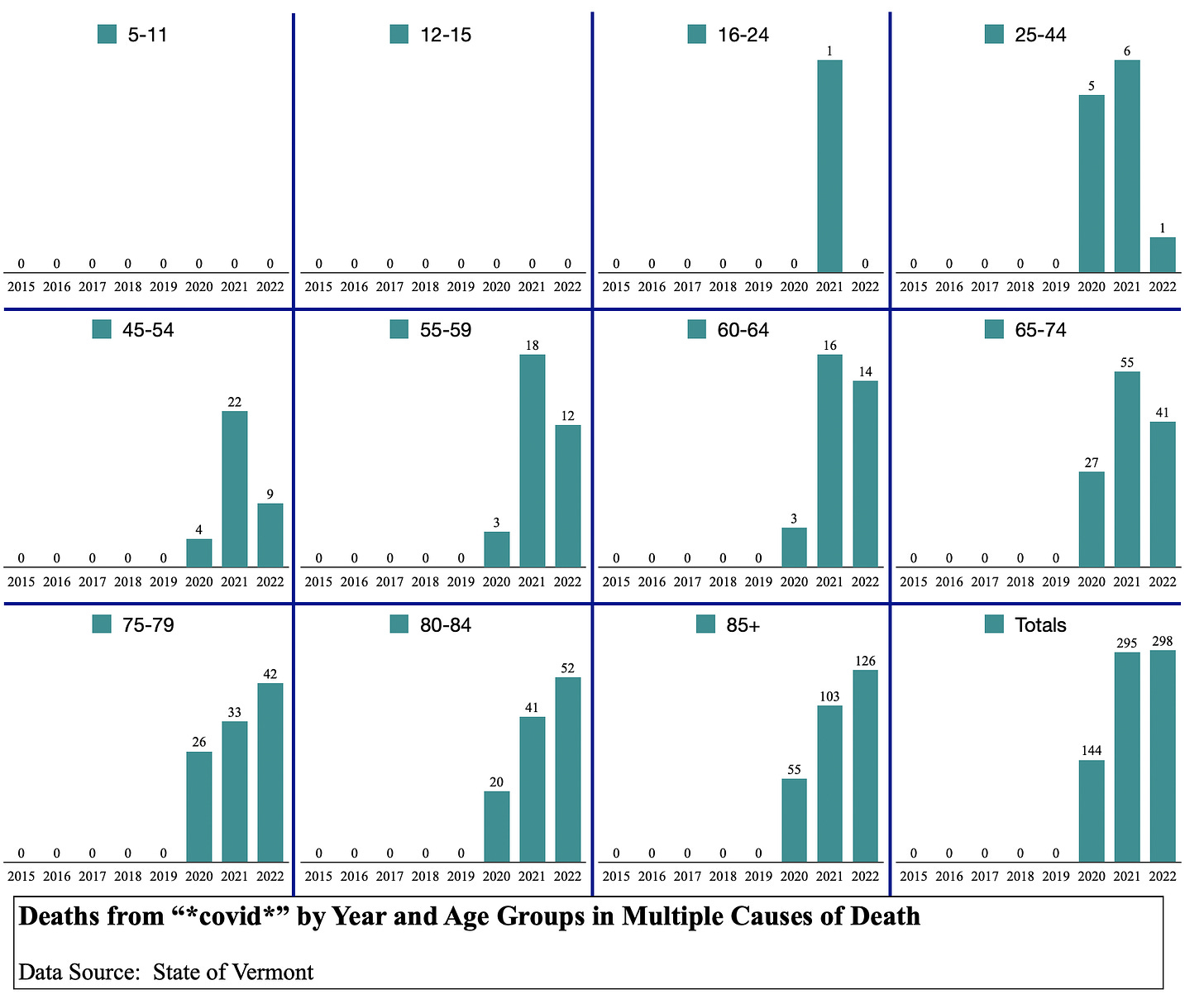
Note: The total for each year is larger than the sum of all age groups, because there are a handful of deaths every year where the specific date of death is unknown which are listed as a date of 99/99 (month/day), and aren’t’ included in the disaggregated data charts that used specific dates as one of the attributes to sort the data.
Note #2: This is intended as a summary of a few of the more interesting observations that are readily discernable right off the bat so to speak, not a thorough deep dive analysis to decisively prove anything beyond all reasonable doubts.
Covid Deaths:
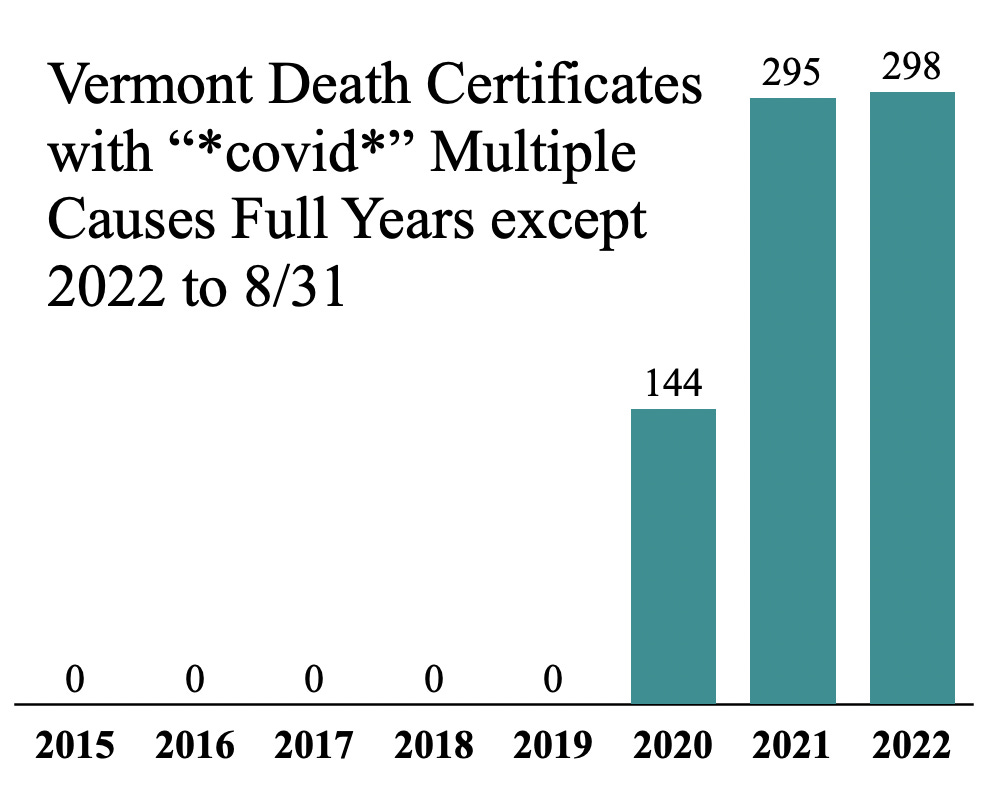
Vermont had a total of 144 deaths that mentioned covid in 2020.
Vermont had a total of 295 in 2021.
Vermont has a total of 298 in 2022, with more than two months left in the year.
If this is a vaccine success, imagine what vaccine failure looks like……..
(“Multiple Causes” means listed as Cause A, B, C, D, or Other; “Immediate Cause” means Cause A exclusively)
Notice that there are literally zero deaths in children even with covid for the entire pandemic.
This is what the trend line looks like:
Notice how the initial covid wave in 2020 - circled in pink - you can see a clear burst of covid deaths occurring over the span of approximately two months, followed by a lull where there were 4 deaths over the next six months as the covid wave ended. This is a beautiful Gompertz curve - in other words, the natural seasonal ebb and flow of coronaviruses.
This trend continued as wave #2 - circled in orange - kicked off in the second half of November, where there this pattern repeats itself.
But once you get into 2021, something changes - instead of deaths falling back to zero like they did in 2020, the deaths keep on substantially rising for an additional 4 months before settling into a baseline of a very low level number of deaths, but never returning to the zero deaths level of the lull in 2020. In other words, the natural seasonality of covid was broken.
Finally, starting in the middle of August, covid deaths explode and this trend is still continuing through all of 2022 to date.
It’s almost as if there were external interventions that occurred at the beginning of 2021 and around August 2021 that triggered the wildly out-of-season covid surges that were considerably more severe than the initial ‘natural’ covid waves…
How many of the covid deaths are actually covid?
One of the biggest data frauds perpetrated throughout the pandemic was defining covid deaths to include a wide variety of deaths that were not caused by covid.
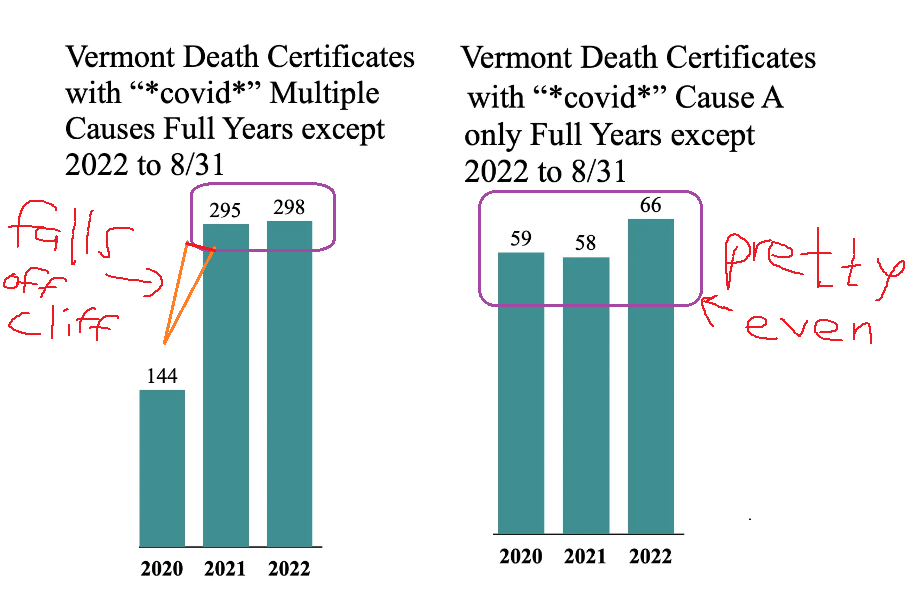
If you compare the number of DC’s mentioning covid as any cause vs the number of DC’s mentioning covid as the primary cause (Cause A), the following anomaly pops up:
In other words, while the number of deaths listing covid as the primary COD is relatively stable 2020 to 2021, and to some degree 2022 (even though 2022 is going to end up much higher by the end of the year), death listing covid as a contributing or underlying COD have skyrocketed from 2020 to 2021 and beyond.
Why are a much, much higher proportion of death certificates listing covid as a non-primary cause in 2021 & 2022 compared to 2020? Does this reflect a trend of coroners using covid to hide something else (wittingly or not)?
In any event, at a minimum, the covid death data from Vermont should prompt public health officials to urgently investigate why covid has morphed into a much bigger killer after vaccines were introduced in the most heavily vaccinated state in the country.
Indications of Vaccine Deaths?
Diabetes:
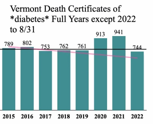
One of the first conditions I was interested in was diabetes. I have seen a number of case reports of new onset or exacerbation of diabetes shortly after vaccination. I wrote about a recent survey from Turkey that found 2.7% of the participants were newly diagnosed with diabetes in the few months following covid vaccination. And Moderna’s kiddie trial had a case of diabetes they admitted was probably vaccine related:
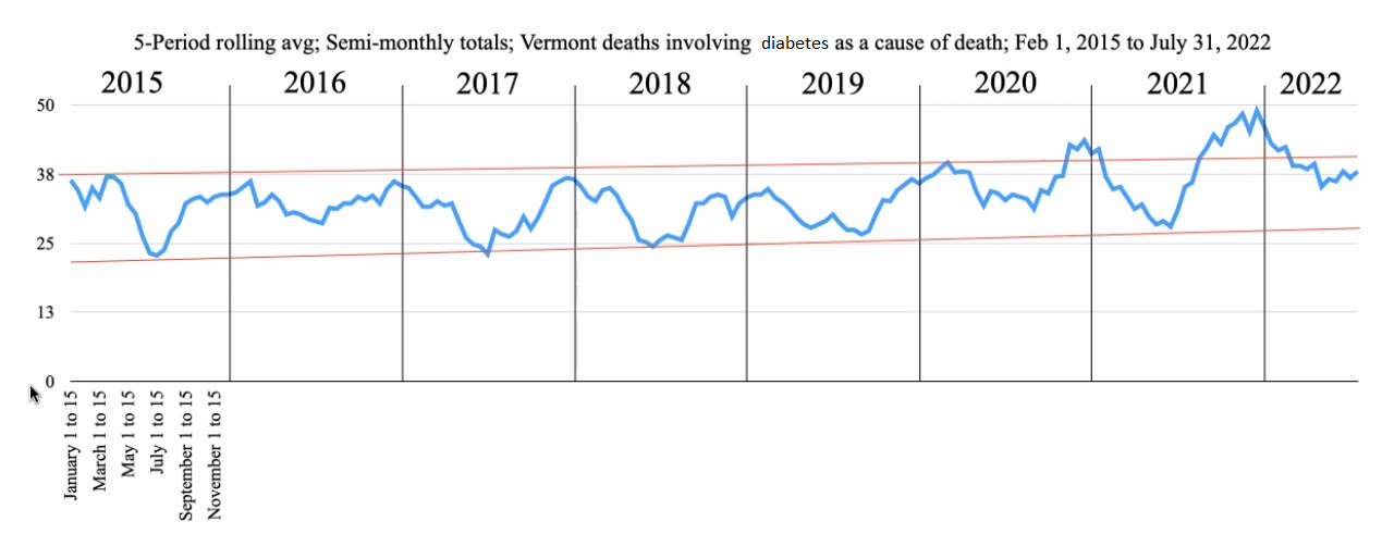
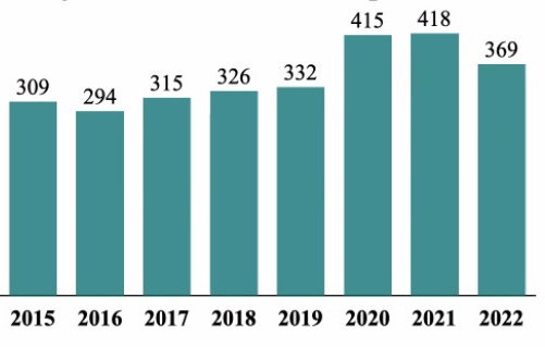
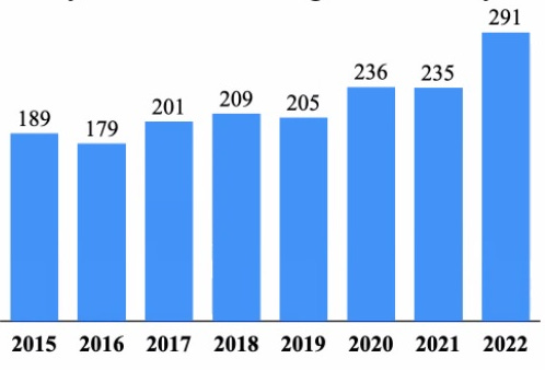
And boy is there a signal here (the pink line is the trend based on the prior 5 years before 2020, the black line is the average of the 5 years prior to 2020).
Diabetes was off the charts in 2020 already, and you can see that 2020 seems to break out above the trendline around the same time that covid came to the US:
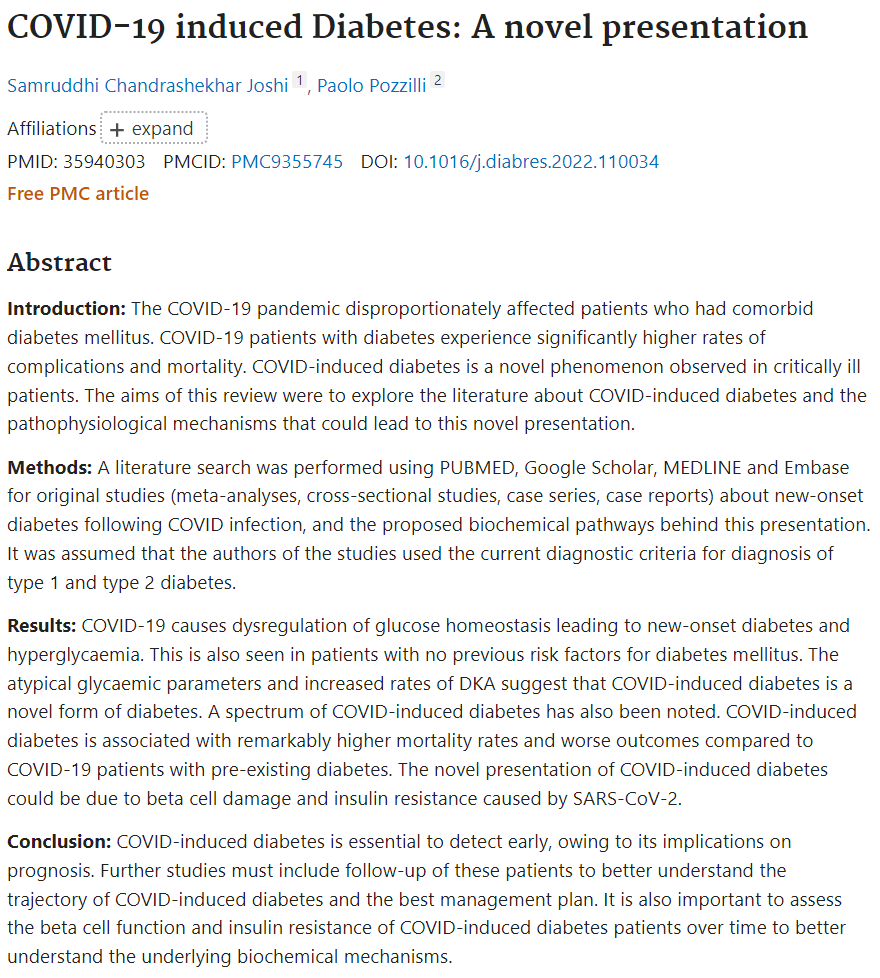
What was responsible for the increase in diabetes in 2020? This is an interesting question. Covid can cause diabetic complications on occasion, something that has been documented in academic literature. For example:
This doesn’t mean that all or even most of the excess diabetes deaths were caused by covid though. There is another obvious variable that is likely to cause excess incidence of diabetes - lockdown policies and behavior. Many people suddenly overnight radically changed their dietary and exercise habits. Many people also suddenly stopped getting routine healthcare or checkups that would pick up pre-diabetes or new diabetes. So it stands to reason that there should be a noticeable uptick in both diabetes incidence, and diabetes-associated deaths.
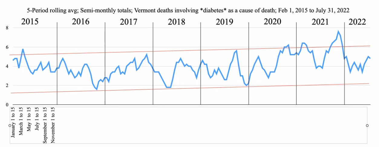
Here is the trendline for diabetes month by month:
Notice how 2020 looks a lot like 2016 - the yearly ‘dip’ to the bottom pink line is missing. 2020 stands out from 2016 though at t eh end of the year, when there is a rise in diabetes deaths concomitantly with the second wave of covid.
2021 does not follow the 2020 pattern. Instead, the 2021 diabetes deems to track roughly with the 2021 deaths that include covid as a COD, exploding up from mid 2021 through the end of the year. Is this a vaccine related phenomenon? That could very well be the case.
However, when we break down diabetes deaths by age, it seems to show a different picture - they’re very inconsistent which age groups get hit in which years:
The diabetes deaths in 2020 were not similarly distributed amongst the various age groups in 2021 or 2022. The diabetes deaths are highest in 2020 compared to all other years in people 25-44, 60-64, 80-84, and insanely high specifically in the age group of 55-59yos.
Now compare this to the covid deaths for the each age groups:
For 55-59yos, in 2020 there were all of *THREE* deaths with covid listed anywhere on the death certificate, compared to the at least 10 excess diabetes deaths. Yet in 2021, there were 18 covid labeled deaths, but diabetes deaths were overall in line with the prior 5 years (although there maybe a slight excess because 2020 should have resulted in a slight diabetes mortality deficit for 2021). In other words, in this age group, there does not seem to be any correlation between covid or vaccines and diabetes. The most straightforward hypothesis to explain the excess diabetes in 2020 in 55-59yos would therefore seem to be one or more of the lockdown policies/behavioral adjustments.
Food for thought: What do you think of the comparison between covid deaths and diabetes deaths for other age groups?
Cardiac Conditions:
This is obviously a major datapoint, as cardiac conditions are prominently claimed to be caused by covid and the covid vaccines and the lockdowns.
All cardiac mentions:
To try and at least partially resolve whether covid was directly causing the excess cardiac deaths, we queried for death certificates that had both cardiac and covid listed as COD’s (we are going to do this for all conditions eventually):
There are considerably more cardiac excess deaths than the number of cardiac COD’s that appear on covid death certificates, so even if we grant that every single cardiac-covid death was either a genuine covid death or was a sequelae of the covid disease, that still leaves the vast majority of excess cardiac deaths unexplained, including those in 2020.
This suggests that lockdowns in 2020 played a role in excess cardiac deaths.
What about the vaccines?
This also points to the vaccines as likely being implicated in 2021 & 2022. Looking at 2022, which absolutely crushes 2020 & 2021 for the first 8 months - and where there were no lockdowns - it definitely seems to imply that vaccines are probably one of the causes at minimum for the insanely elevated cardiac fatalities. It could also be that there is sustained elder abuse in nursing homes and LTC facilities, where vulnerable seniors with underlying cardiac conditions (or where the coroners are lazy and simply mark every death they don’t have a clear alternate cause for as a cardiac death, which has actually happened elsewhere) are being euthanized deliberately or via indifference and neglect by staff. Perhaps when we go through them all individually, we can get a better idea of what is going on.
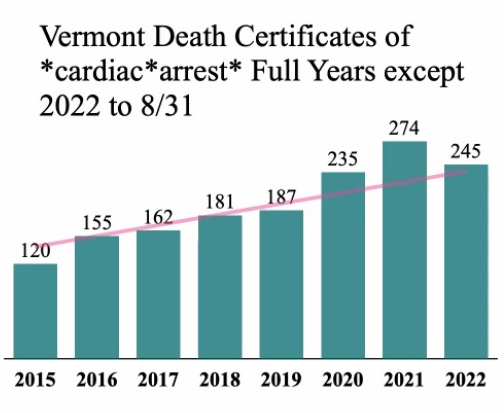
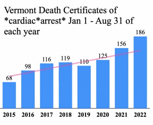
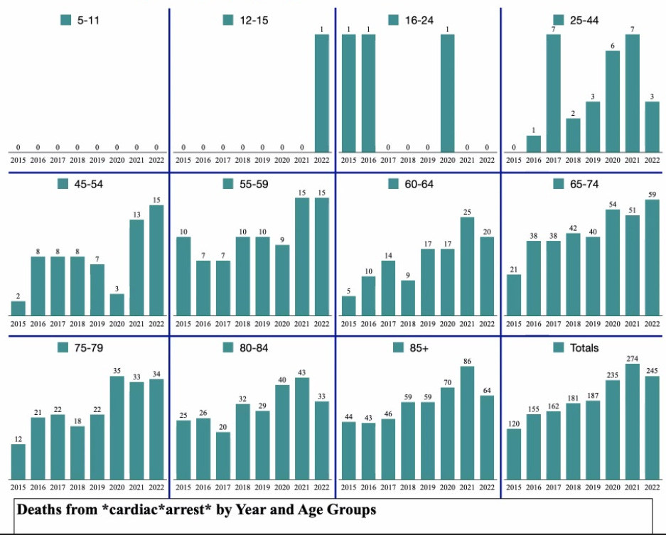
Cardiac Arrests:
Interestingly, cardiac arrests were in excess territory only in the last 5 months of 2020, compared to all of 2021 and all of 2022 (to date):
The age distribution is interesting:
Basically, there is a massive amount of excess cardiac deaths, that cannot be plausibly explained by covid.
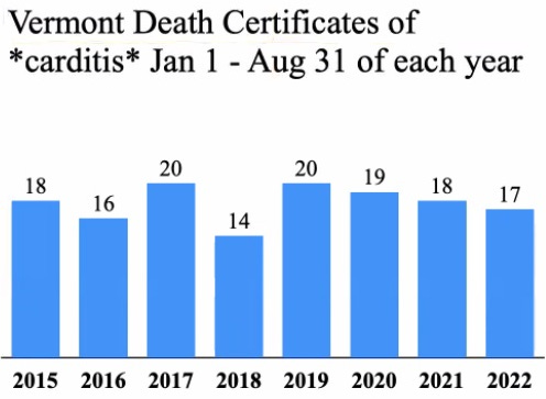
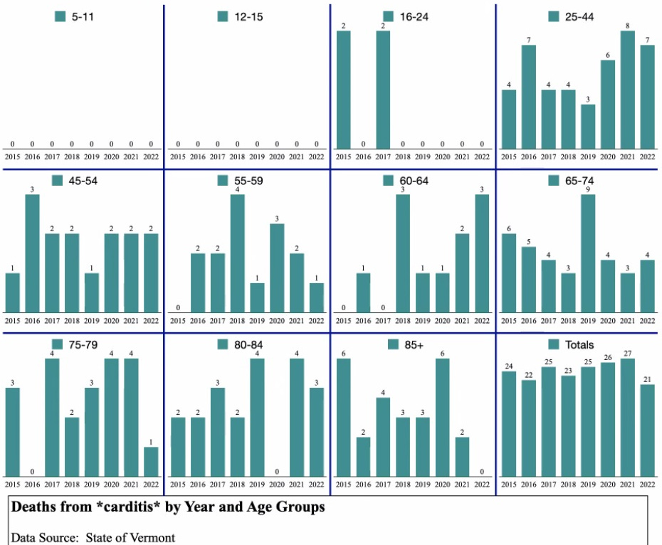
One final observation - there is no increase in death certificate's with either myocarditis or pericarditis at all:
Does this mean that myo/pericarditis is not being identified in cardiac deaths?
Pulmonary Embolisms
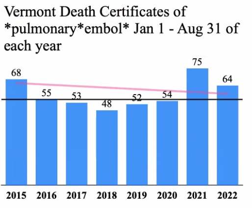
PE’s are up a bit in 2020, and explode in 2021. They are actually below the expected baseline very slightly for the first 8 months of 2020(!):
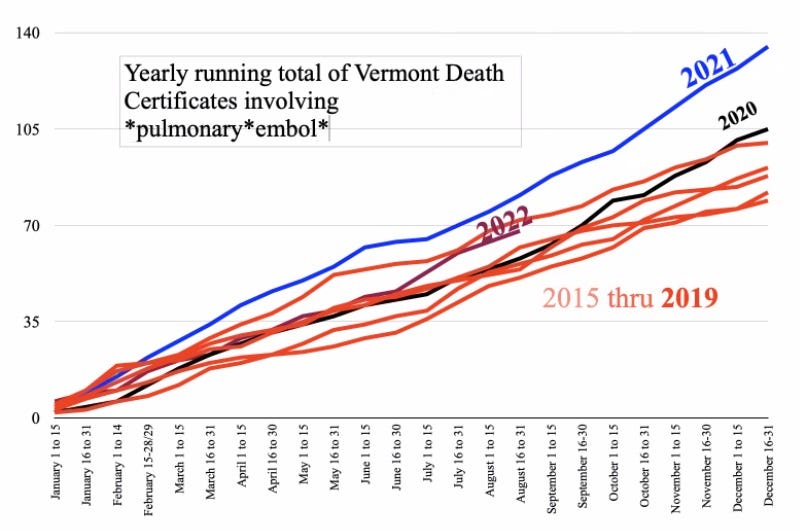
As you can see, 2020 barely breaks above the prior 5 years, even by the end of the year, but 2021 is far and away elevated beyond any other year, and 2022 while tracking higher than 2020 is barely in excess territory (although it could well be that 2022 is much more excess than appears here, because there should have been a sharp deficit following the morbidly obese 2021 excess).
When you look at the week by week trends, 2021 sticks out as a massive outlier:
Summary
Overall, it seems like the initial covid wave in Vermont was barely a blip, whereas the winter covid wave at the end of 2020 was more substantial. 2021 and 2022 see an explosion in covid labeled deaths, especially after practically everyone is fully vaccinated. Furthermore, while there are some increases in a variety of other conditions in 2020, they do not really correlate well to covid, and the increases are generally far more pronounced in 2021 and/or 2022.
It is important to make the following caveat: Anywhere from 20-40% of death certificates are inaccurate and contain errors.2 Thus, just because death certificates show a trend does not automatically mean that it is accurately documenting an epidemiological phenomenon. What is definitely true is that these trends are deeply concerning. In light of similar patterns in MA death certificate trends, plus the broad mosaic of evidence pointing to the association of vaccination with a whole assortment of devastating injuries and conditions, it should in a rational world be sufficient to pull the vaccines from the market pending the results of a very thorough investigation.
At any rate, this is definitely NOT what we were told about the severity of covid, not what we were promised about the covid vaccines.
Explanation of the different types of graphs/charts used
The single bar graph with green bars is capturing the total number of death certificates that contain a specific condition for the entire year of all years *except 2022*, which only has the death certificates for deaths that occurred through 10/26/22:
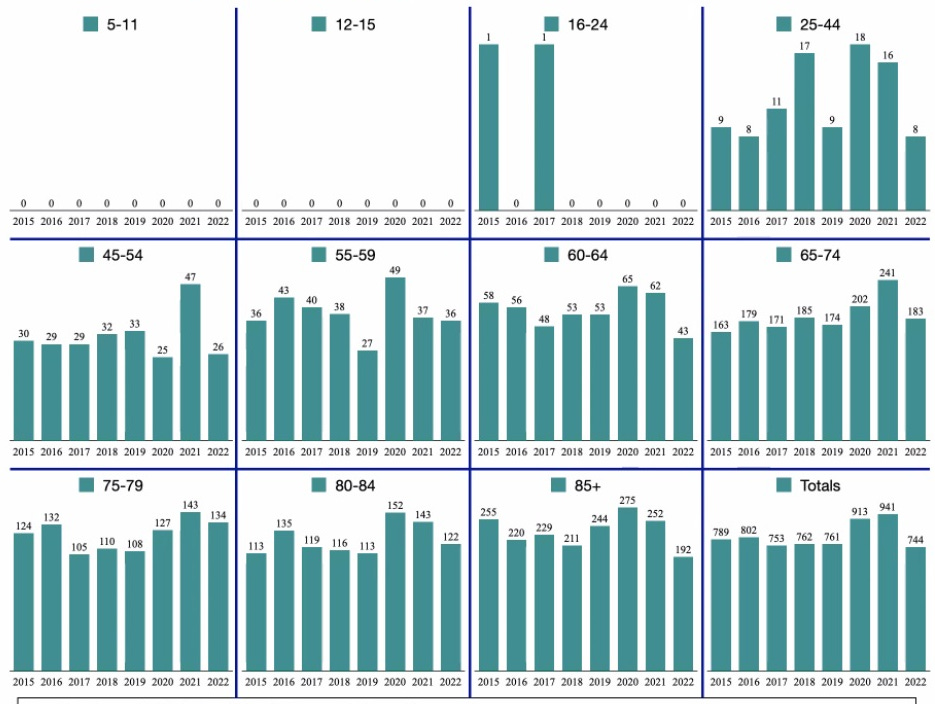
The bundle of small bar green graphs contains the age breakdown of of the data shown in the green bar chart above:
The bar graph with blue bars is capturing the number of death certificates that contain a specific condition for the months of January-August of each year. The point of this chart is to show what 2022 looks like compared to previous years over the same amount of time:
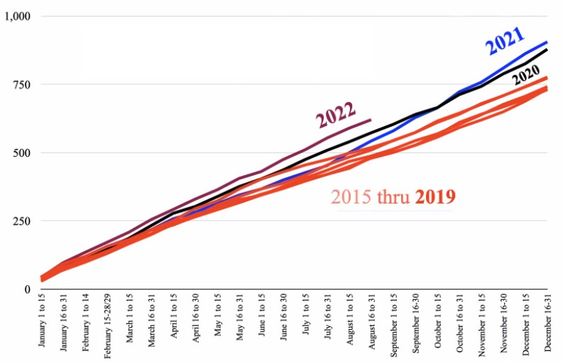
The chart with the bundle of differently colored lines rising from left to right is capturing the cumulative total of death certificates that contain a specific condition for each year as the year progresses. The years 2015-2019 are all the same color - red - in order to highlight what the previous 5 year baseline looks like to make the contrast between the pandemic years and the baseline years more easily visible. (The charts documenting death certificates containing covid do not have the red lines because there was no covid prior to 2020.)
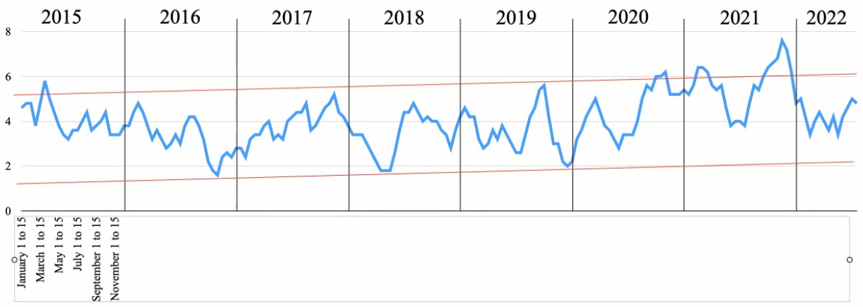
The charts with lines that bounce around all over the place like an EKG readout are capturing the number of death certificates that contain a specific condition for every half month - in other words, the trend of how often these occur by
The description of a condition is the text input used to search the spreadsheets. For instance, *covid* means that anything that contained the text string “covid” as a cause of death in any category (Cause A, B, C, D, or Other).
For instance, see:
Discrepancies between clinical and autopsy diagnosis and the value of post mortem histology; a meta-analysis and review
Survey of New York City resident physicians on cause-of-death reporting, 2010
Does quality control of death certificates in hospitals have an impact on cause of death statistics?
Accuracy of death certificates in COPD: analysis from the TORCH trial
Using National Inpatient Death Rates as a Benchmark to Identify Hospitals with Inaccurate Cause of Death Reporting - Missouri, 2009-2012
Death certification errors at an academic institution
Inaccuracy of death certificate diagnosis of tuberculosis and potential underdiagnosis of TB in a region of high HIV prevalence
Quality of cause-of-death statements and its impact on infant mortality statistics in Hermosillo, Mexico
Infant Mortality, Cause of Death, and Vital Records Reporting in Ohio, United States















Check out Coquin de Chien on Vermont's Fentanyl apocalypse, using the same data:
https://coquindechien.substack.com/p/vermont-the-social-cost-of-false
Great job!!! Contexting of each cause or group of causes was enlightening. I wasn't so nice in my assessment of fentanyl deaths in these death certificates. People can find their way to the article I just released. More to come regarding Vermont. You're doing God's work getting this data and analyzing it.