This is the second installation in this series, part 1 here:
Today we will look at cancer deaths where cancer is the UCoD.
The significance of the UCoD
It is critical to understand the following specific definitions to follow this article:
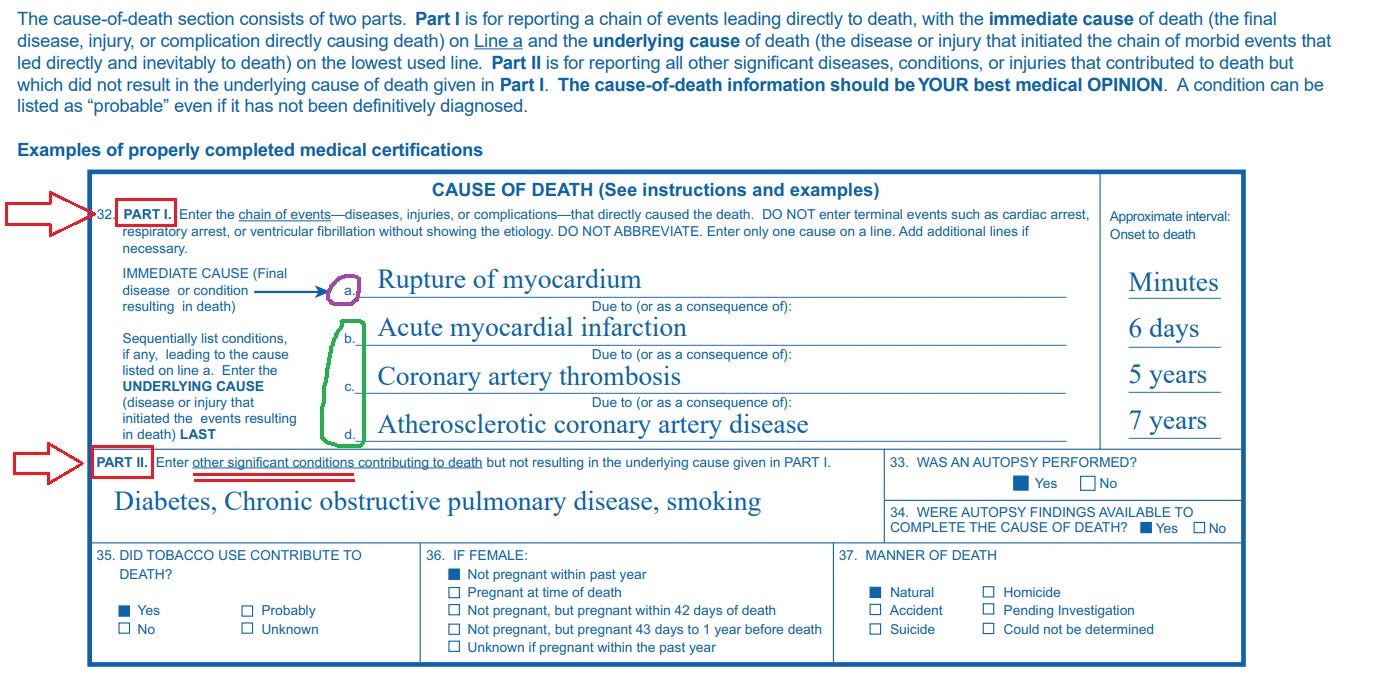
This is what it looks like on an actual death certificate (see the instructions on the top):
In short, the UCoD designation is meant to highlight the condition or injury that was the primary catalyst or cause of the death, or the chain of events directly culminating in the death.
Cancer Data
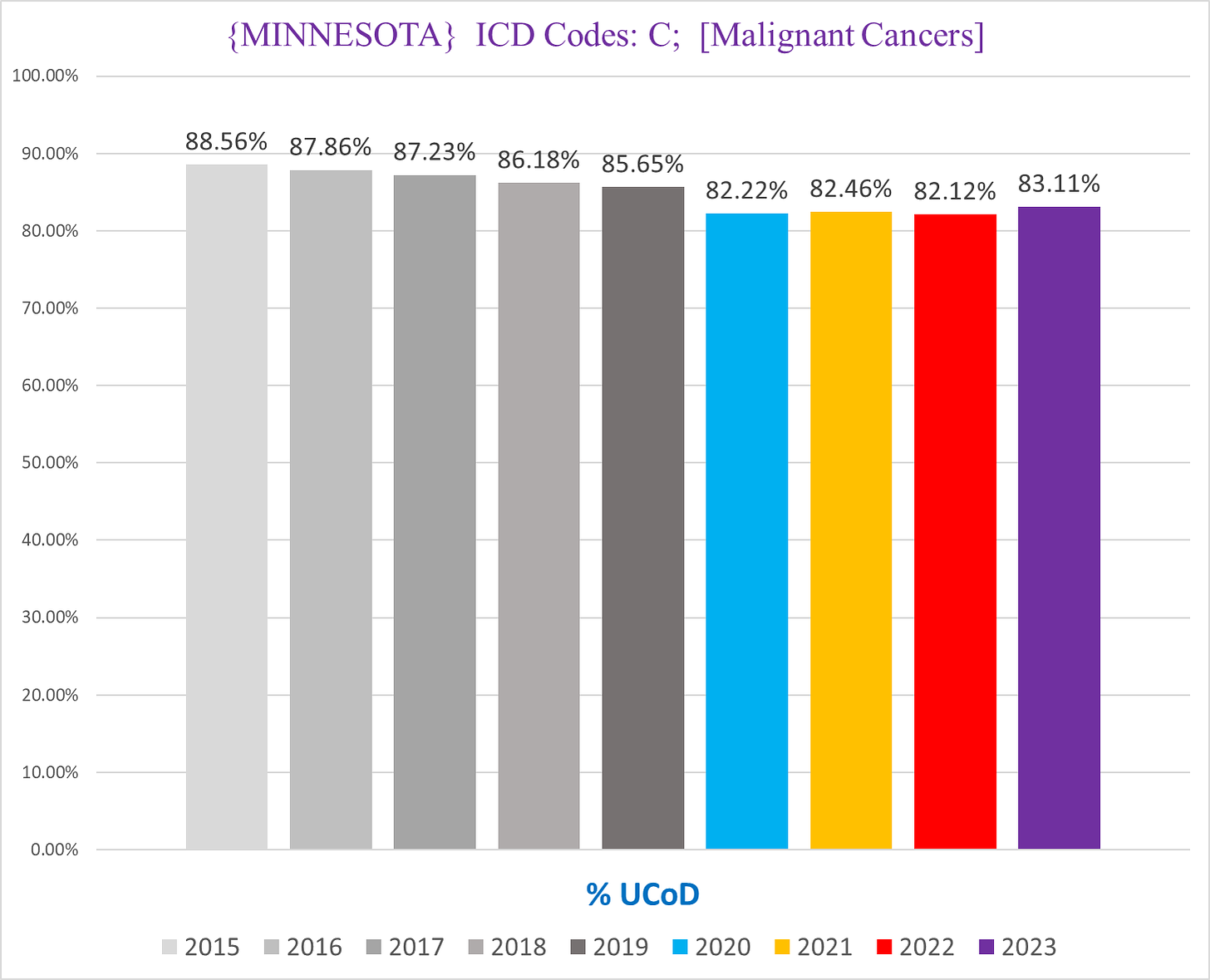
Cancer is the UCoD in the overwhelming majority of deaths that document a cancer as a CoD (hereafter we’re going to simply call these “cancer deaths”), visualized in the following chart that shows the % of cancer deaths where a cancer is identified as the UCoD:
This makes sense - when someone afflicted with cancer dies, the death is usually caused by a pathology initiated by the cancer.
However, there is an open question about the accuracy of UCoD/MCoD designation with cancers (and to be frank with most other conditions too). So we must keep that in mind as we analyze the cancer UCoD/MCoD data here.
Cancer UCoD Deaths
Deaths where the UCoD is a cancer (hereafter “cancer UCoD deaths”) is useful to us because it shows the incidence of deaths that ostensibly died because of - and not “died with” a la so many ‘covid deaths’ - a cancer. Again this is not to say that the cancer MCoD deaths are necessarily “died with cancer” and not because of cancer, merely that for these deaths it was adjudicated and determined that a cancer was the primary cause of death.
This is helpful because it establishes a baseline minimum for the trend of genuine cancer deaths.
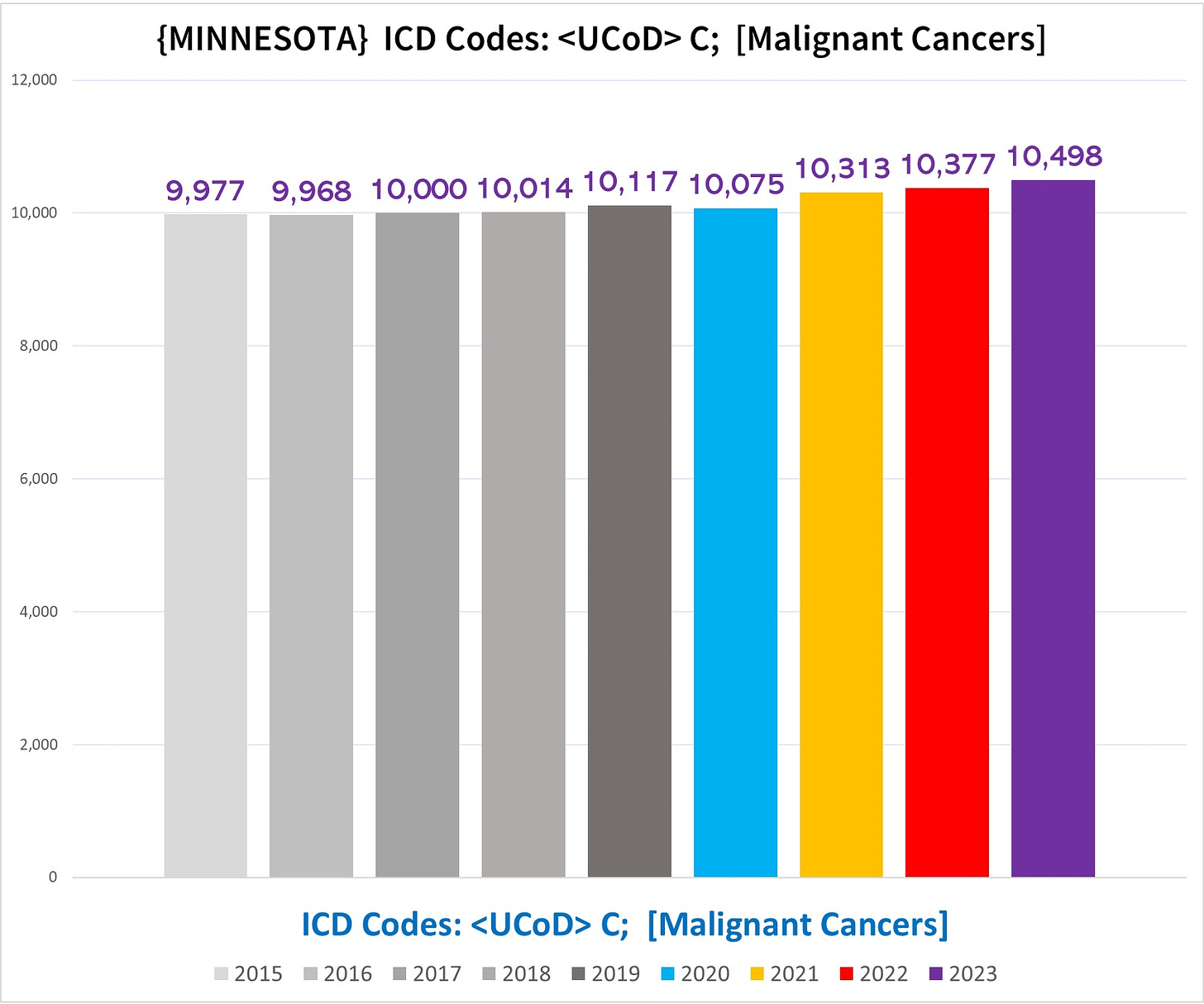
The following chart shows the total number of cancer UCoD deaths in Minnesota per year:
In this grand total combining all demographic cohorts, you can see that in 2020 there is no increase, but all three subsequent years are clearly above the expected number, and gets worse each year.
However, like we saw in part 1, this is misleading, because nursing home resident deaths (NH deaths) and non-NH deaths cancel each other out, illustrated by the charts below (left side NH deaths, right side non-NH deaths):
In what might initially seem surprising, NH cancer UCoD deaths are running a mortality deficit in every pandemic year (although they seem to be recovering somewhat in 2023, which is not a good sign).
What happened is that NH residents were killed off by a bunch of other stuff in 2020, including, and perhaps especially, NH residents with cancers. In other words, the reservoir of potential NH residents with cancers was depleted by mass deaths in 2020, so many of the NH residents who were “supposed to” die in 2021-2023 from cancers were instead killed off early by something else.
Additionally, it is highly probable that some number of deaths where the real UCoD was cancer were attributed to something else, like covid. We actually discovered thousands of deaths where the condition labeled by the coroner filling out the death certificate as the UCoD was replaced by the CDC with covid. This is true even for deaths in the non-NH residents, meaning that the cancer UCoD deaths in the non-NH residents is also likely missing cancer deaths with the UCoD misattributed to a different condition.
NON-NH Cancer UCoD Deaths
Since the real trend of increasing cancer UCoD deaths is in the non-NH residents, we’ll focus there.
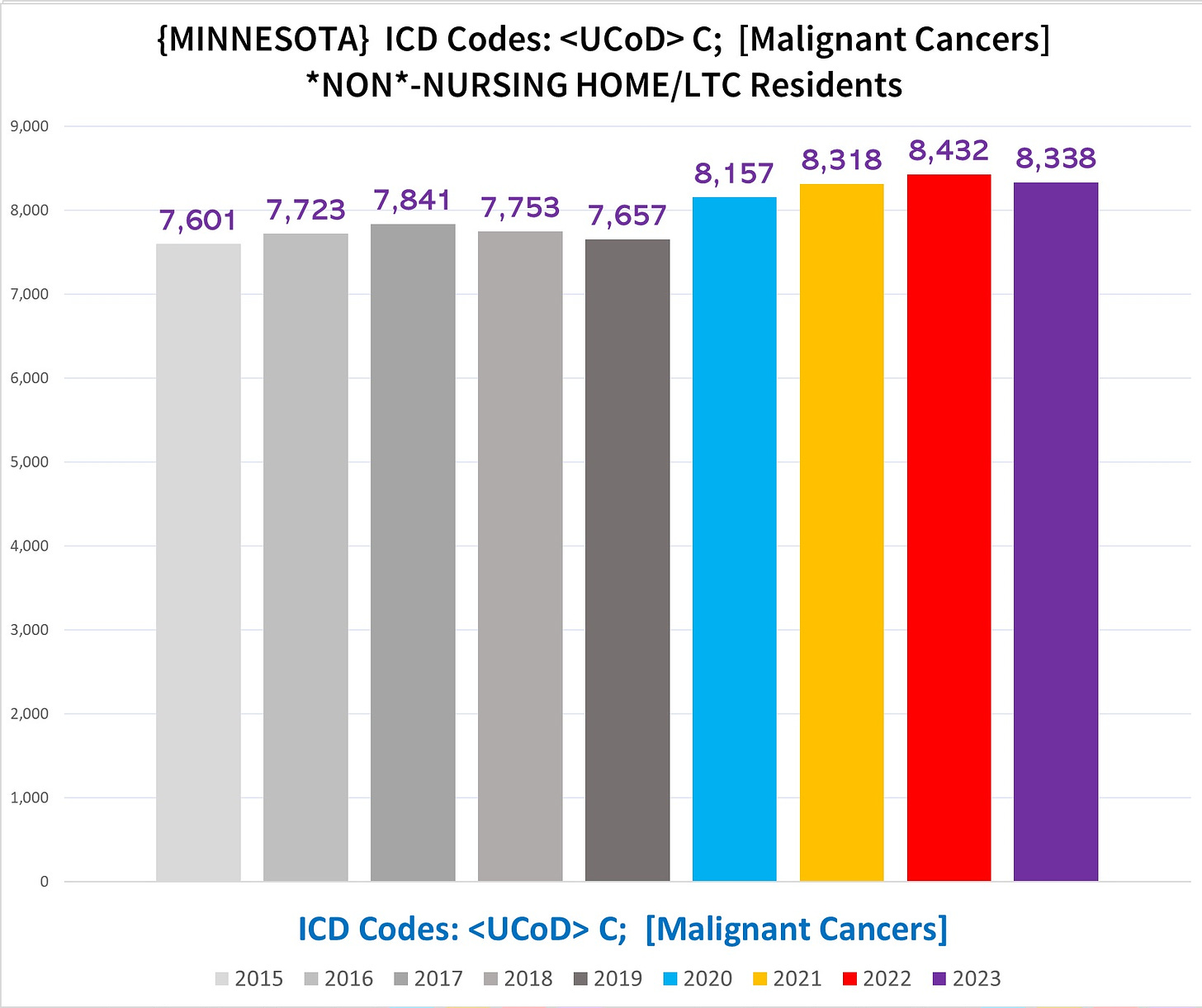
The following chart shows the # of cancer UCoD deaths in non-NH residents:
Here the excess cancer UCoD deaths is obvious starting in 2020 and continuing through 2023 which is still somehow running higher than 2020 (!!).
There is another major Simpson’s Paradox hiding here, caused by differences in the various age cohorts.
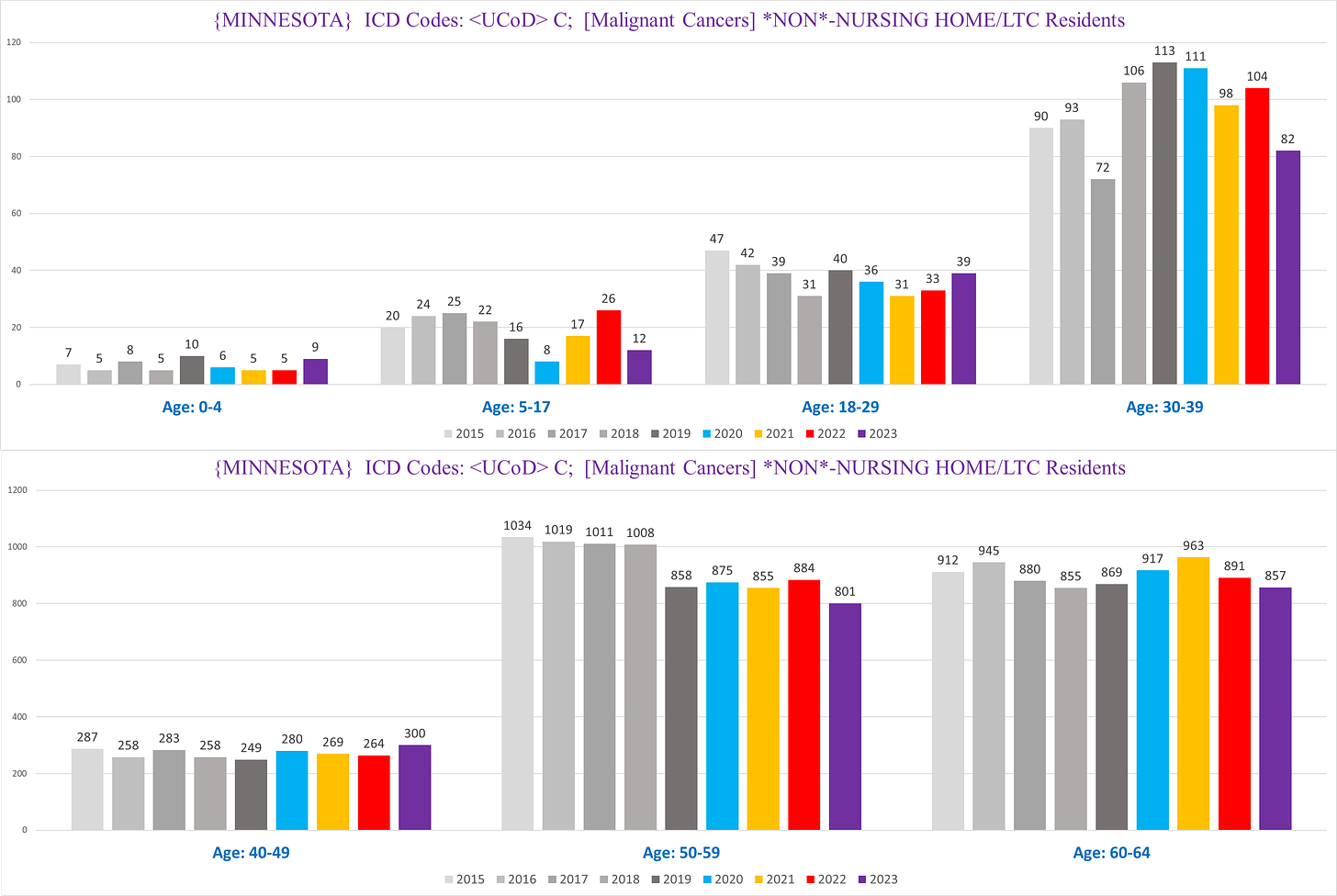
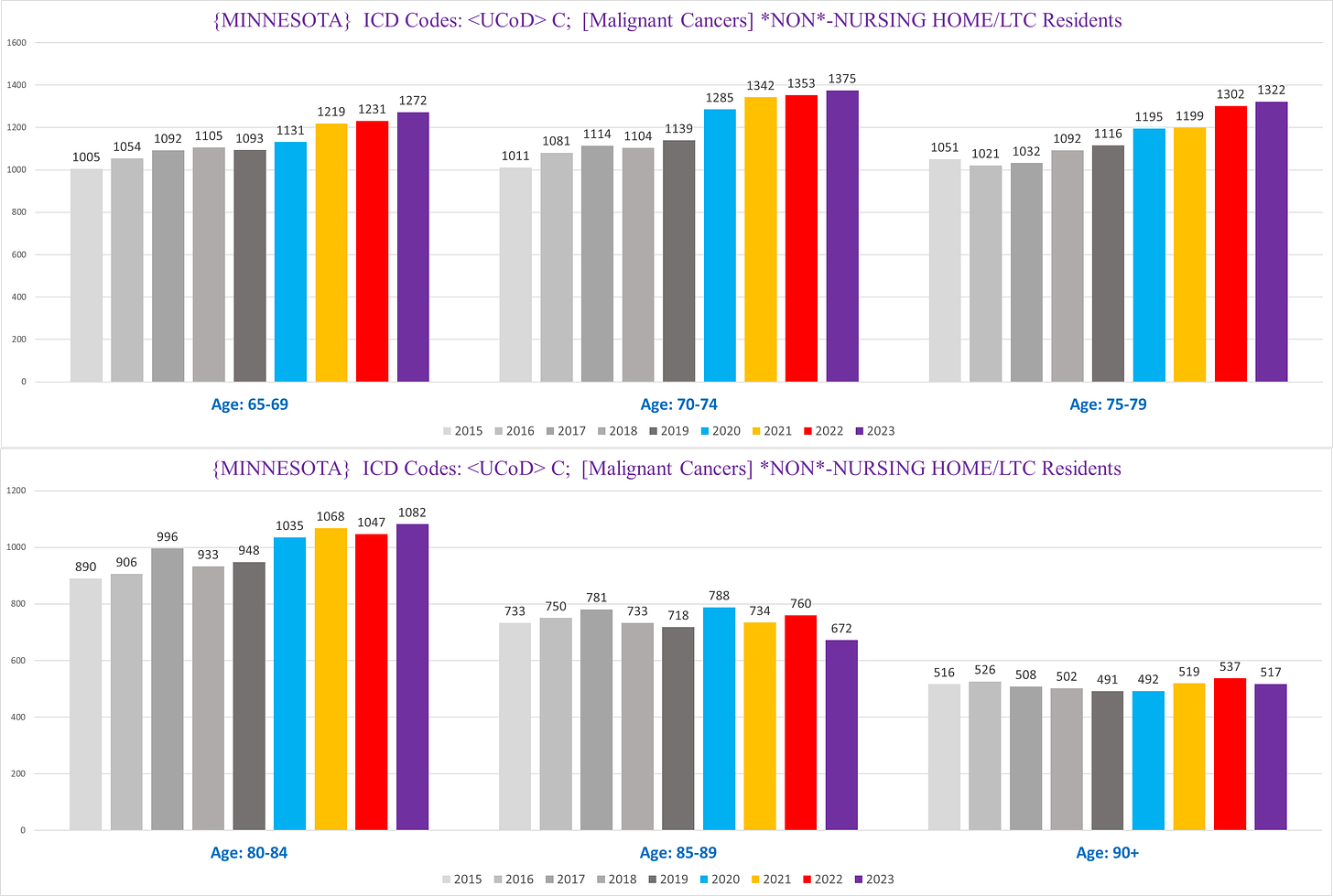
If we break apart the cancer UCoD deaths by age, we get the following:
You can see that various age cohorts show drastically different trends.
Particularly bizarre is the 50-59 year old group, who lose 150 deaths in 2019 from 2018, but both periods - 2015-2018 and then 2019-2023 - are pretty flat and level. This seems more than a bit incredulous - it is implausible that we cured overnight 15% of cancers among a narrow 10-year band of people, while at the same time cancer UCoD deaths rose in other age groups. (I have entertained many possible explanations for this but none really seem all that credible or reasonable to me.)
Moreover, there is a marked difference in the general trends between the seniors and ‘juniors’ (<65 years old).
These have the effect of distorting the trend of cancer UCoD deaths when we combine all age groups.
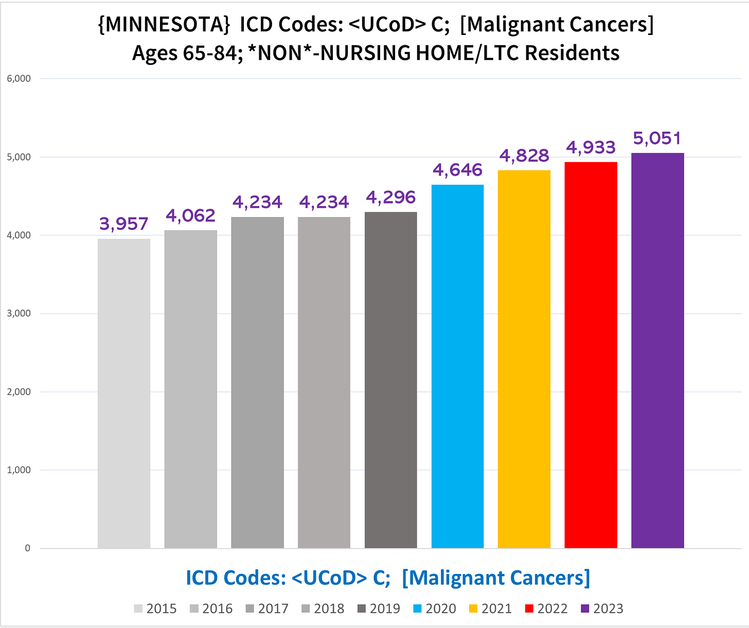
If we focus on the senior population - where the excess deaths overwhelmingly are located -, the degree of excess cancer UCoD deaths is largest in the 65-84 year old groups. If we combine those into one chart, we get the following:
There is almost 10% excess in 2020, and 2021-2023 are all in the 15%-18% excess range. Also strikingly, in this age cohort every pandemic year increases over the prior year. Considering that this chart represents the minimum baseline for cancer UCoD deaths, and that there is reason to believe that some % of cancer deaths are going unnoted or inappropriately not being identified as the UCoD, the number of true cancer UCoD deaths is likely higher.
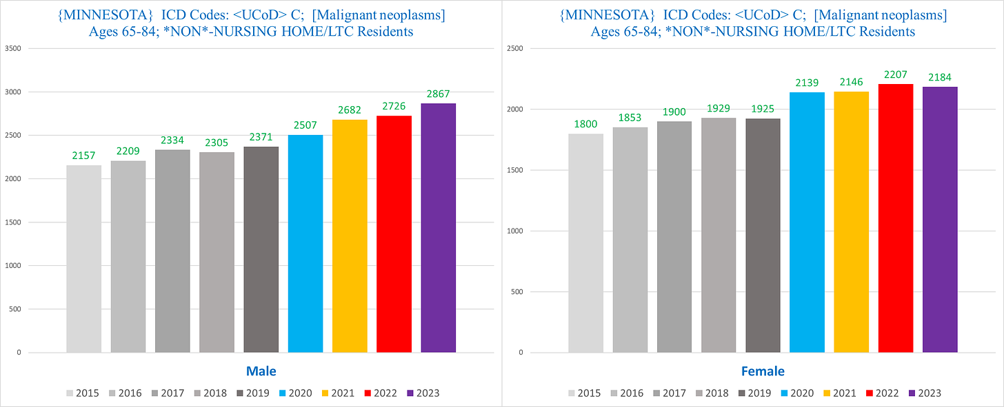
If we break this down further by sex, among men ages 65-84 (left) 2023 actually eclipses 20% excess from 2019:
Summary
Deaths where the UCoD is attributed to a cancer are well above normal in Minnesota for all four ‘pandemic era’ years. This excess is mostly driven by the excess deaths in the 65-84 year old people who are not nursing home residents.
Next article, we look at MCoD Cancer Deaths (to be explained)…
Note: I made this article shorter than I usually make these types of articles, to see if readers like this format better, where there is less information to absorb in one shot, so -



Given that the 65-84 non-NH group shows large excess deaths (~10% or more) in 2021-2023 (which is consistent with the overwhelming majority of excess mortality data sources around the world), but the NH group of the SAME AGE RANGE shows a very sudden, sharp (~20%), and SUSPICIOUS decrease in deaths starting in 2020, isn't it extremely plausible that there is a built-in mechanism for underreporting/undercounting NH deaths? If TPTB want to cover up vaccine-induced deaths by systematically undercounting total deaths, then the NH population would be the most logical and ideal target for undercounting since that's where a large fraction of deaths occur no matter what- and of course they might apply the undercounting to 2020 onwards rather than 2021 onwards to deflect suspicions about what they're doing. While this may not be easy to prove and some may automatically reject this theory even without disproving it, I think it is quite likely unless it is conclusively disproven.
Great work. I think shorter articles in a series is easier to digest and understand for me.