Unpacking Minnesota's Rising Cancer Mortality, Part 1
Yes it's definitely still in deep excess territory... and showing little sign of slowing
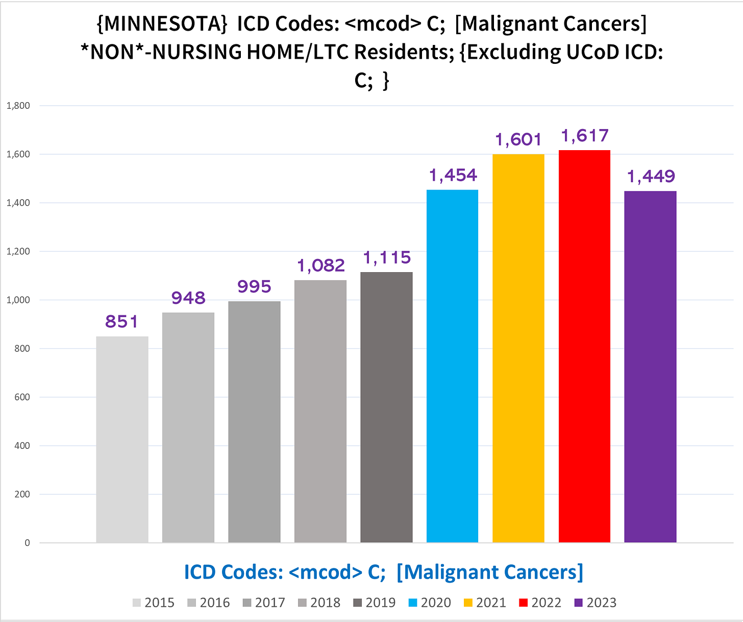
The above chart looks mighty impressive, almost as if challenging you to deny the self-evident morbid reality of a cataclysmic cancer calamity. But is this chart - which accurately depicts the data indicated by the chart’s title - telling us the whole story, or is it cherry picked parameters to make it appear as if there’s a massive surge in cancer mortality that isn’t really there?
I recently published an article highlighting that there are a surprising number of case reports documenting cancers arising after vaccination with a genetic covid vaccine, which apparently has gotten around. Moreover, the notion that there is an issue - of course a “mysterious” issue, to be sure - of rising cancer incidence, morbidity and mortality in the general population has (finally) trickled up into the mainstream. But how big is the increase? And how confidently in whole or in part can we attribute it, or preclude attribution, to/from anything specific?
Death certificates are a flawed tool for data construction. They are rife with errors, prone to biases, subject to capricious and sometimes deliberate manipulative policy changes from on high, and rarely tell the complete story of the decedent’s demise. They are under the aegis of state health departments and the CDC, which doesn’t exactly inspire confidence about their quality or integrity. But neither is it an indefatigable Sisyphean task to extract useful, useable data from the information logged and recorded on these indubitably wanting instruments, although progress often creeps along slowly enough to give the illusion that Zeno’s motion paradox accurately describes reality.
To our good fortune, cancer is not a condition that would be documented without an official diagnosis, so we can at least be confident that a decedent recorded as having died with cancer did indeed die afflicted by cancer.
To our less-good fortune, the inverse is also true - undiagnosed cancers will not appear on death certificates. Furthermore, sometimes even a diagnosed cancer can be omitted by an unscrupulous or cowed coroner. This is not hyperbole - Ethical Skeptic had a relative killed by colon cancer but the ME refused to put it on the death certificate.
There are other confounding factors and messiness which we’ll see as we try to sort out what is going on in Minnesota with cancer mortality. Because of the complexity and breadth of information, this is going to take a few articles to cover.
This article will broadly overview cancer mortality in the Minnesota death certificates, and provide some essential background to unpacking the various trends.
It still feels bizarre and surreal that there is such glaring signals in publicly available mortality data completely ignored and disregarded by public health. It’s their own data! (Yes they’re evil and complicit etc., but still.) So fasten your seatbelts and get on the Magic School Bus as we explore the otherwise dull and droll intricacies of number crunching (I have fond memories of watching this show as a little kid, back when kids shows taught real sciency science, not woke gibberish indoctrination).
Background
We must begin with some eye-glazing but necessary basic pointers about how death certificates work (**Click here to skip straight to the data below**).
When someone dies, there is a death certificate that is filled out for official / legal purposes. Death certificates contain a lot of information (some states include more than others), including the causes of death (CoD).
Causes of death refer to the medical conditions that ultimately played some role in the demise of the decedent. To qualify as a CoD, a condition only needs to contribute to the medical decline of the decedent in some way, but doesn’t have to be directly responsible for whatever ultimately killed the person. If someone had high blood pressure, and subsequently suffered a heart attack that led to cardiac arrest which killed them, all three conditions qualify as CoD. On the other hand, this unfortunate fellow’s ingrown toenail is not a cause of death, because it didn’t contribute to their demise.
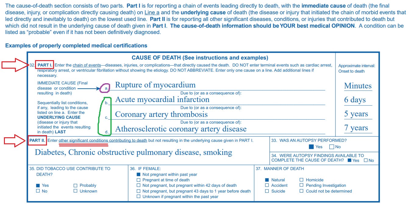
The sample death certificate below is from the CDC’s own guidance explaining how to properly fill out CoD’s on a death certificate (you don’t need to understand the difference between Cause A, B, etc for this article):
ICD 10 Coding System for CoD’s
There is a fancy coding system that is used to classify the many thousands of medical conditions that can play a role in death known as the International Classification of Diseases. Every few years, it is updated/revised to keep up with new medical (or bureaucratic) developments, as new conditions are discovered (created?) and old conditions are reorganized or reclassified.
The current iteration of the ICD that was used for the deaths we’re looking at is the ICD 10 (so named because it is the 10th edition). It is basically a hierarchical classification system:
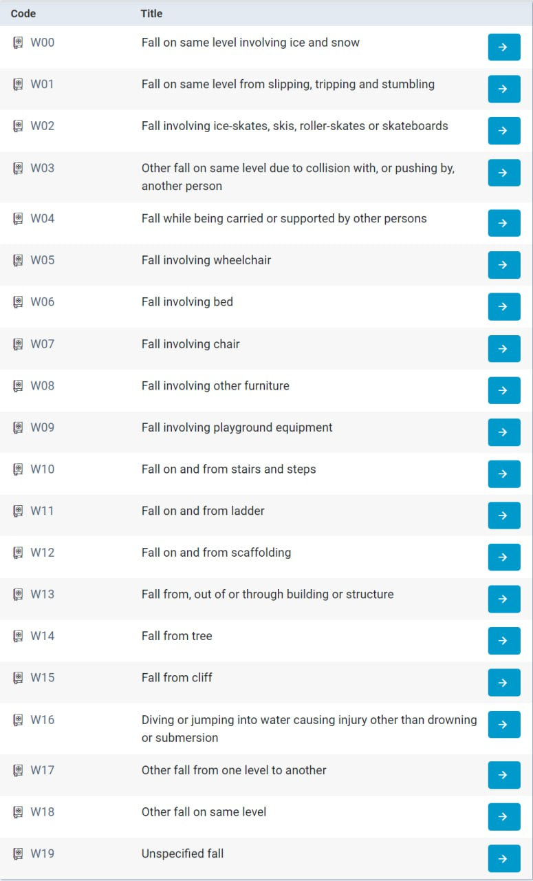
There are codes for practically every random weird thing you can think of:
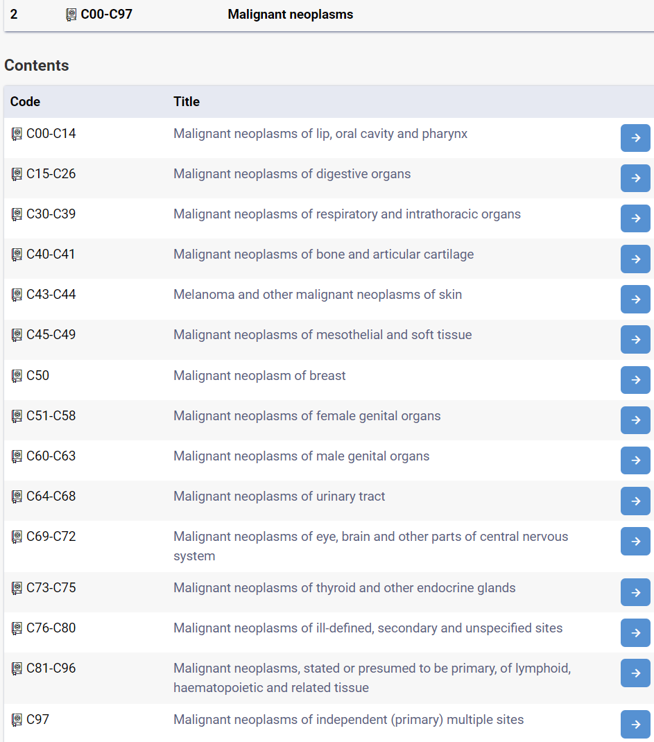
There are two types of tumors - malignant and benign. Malignant cancers are the kind that spread rapidly destroying everything in their path like a horde of marauding Orcs. In the ICD 10 coding system, malignant neoplasms - i.e. malignant cancers - are indicated by a ‘C’ code:
Thus we’re going to be looking at the ‘C’ codes, used to indicate “malignant neoplasms”. (The benign tumors are ICD 10 Codes D00-D48.)
Cancer Death Data
Now for the exciting part….
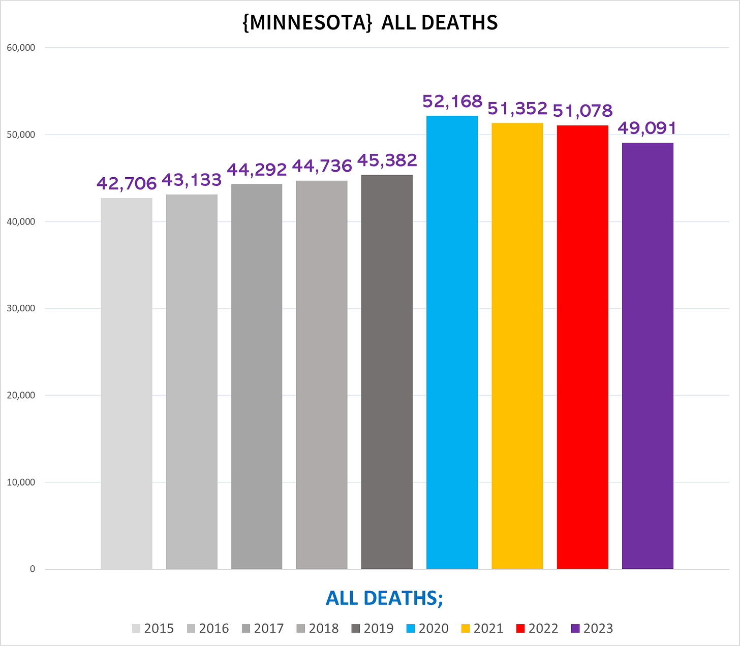
The following chart shows the total number of deaths each year in Minnesota:
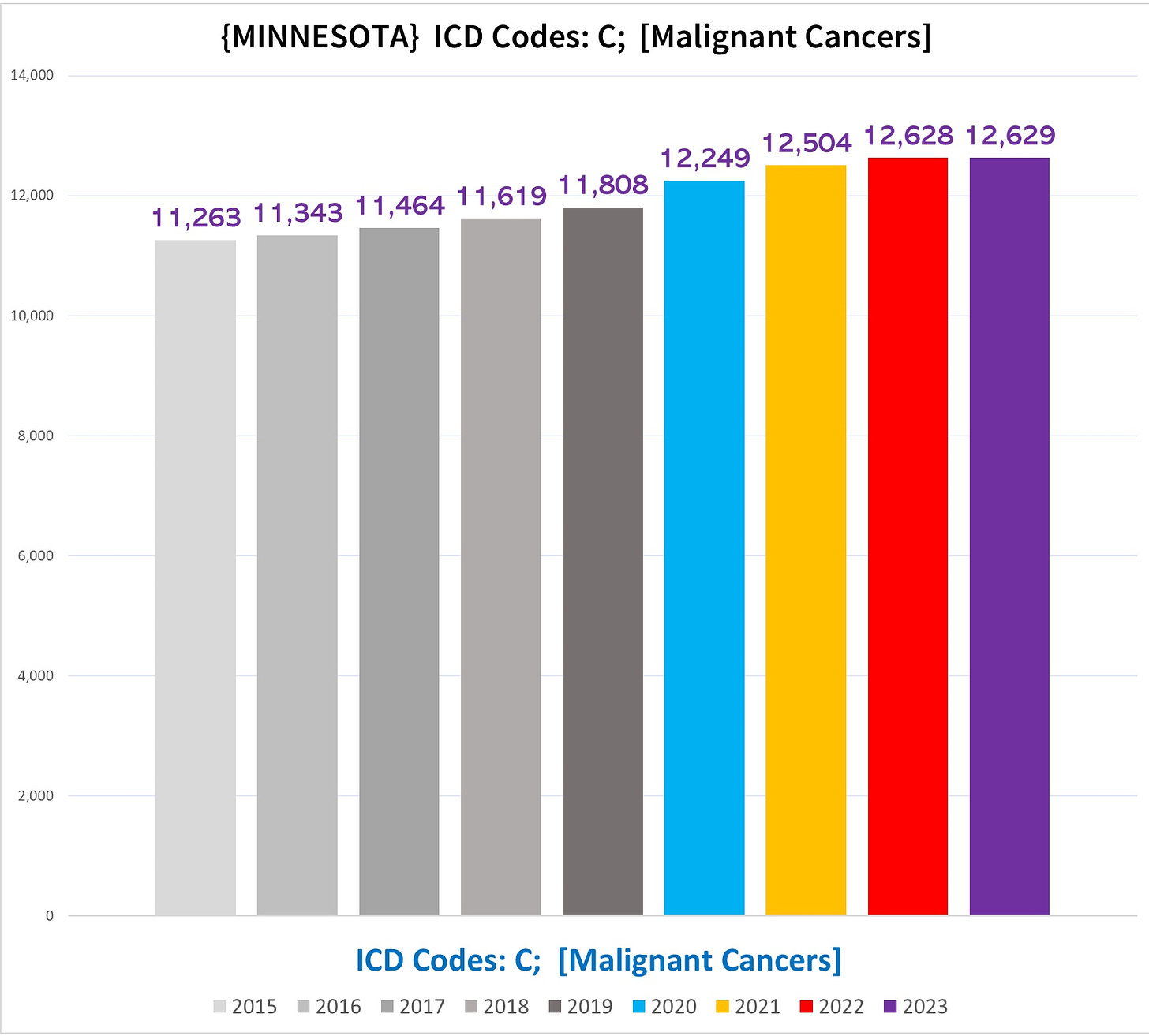
The next chart shows the total number of deaths each year in Minnesota that have at least one ‘C’ code on the death certificate:
So just by immediate first impression, while both show excess mortality in every pandemic year, the trends are going in opposite directions - overall mortality going down after 2020, cancer deaths nominally rising after 2020. This is a good lead indicator that there are disproportionate excess cancer deaths compared to the overall mortality burden in the pandemic years.
We can see that the total number of deaths with a cancer code goes up over the trendline that existed pre-pandemic by a very slight margin - somewhere in the ballpark of 300-600 extra cancer deaths, or around 0.025%-0.05% increase above what we would expect to see if cancer deaths kept to their pre-pandemic trend.
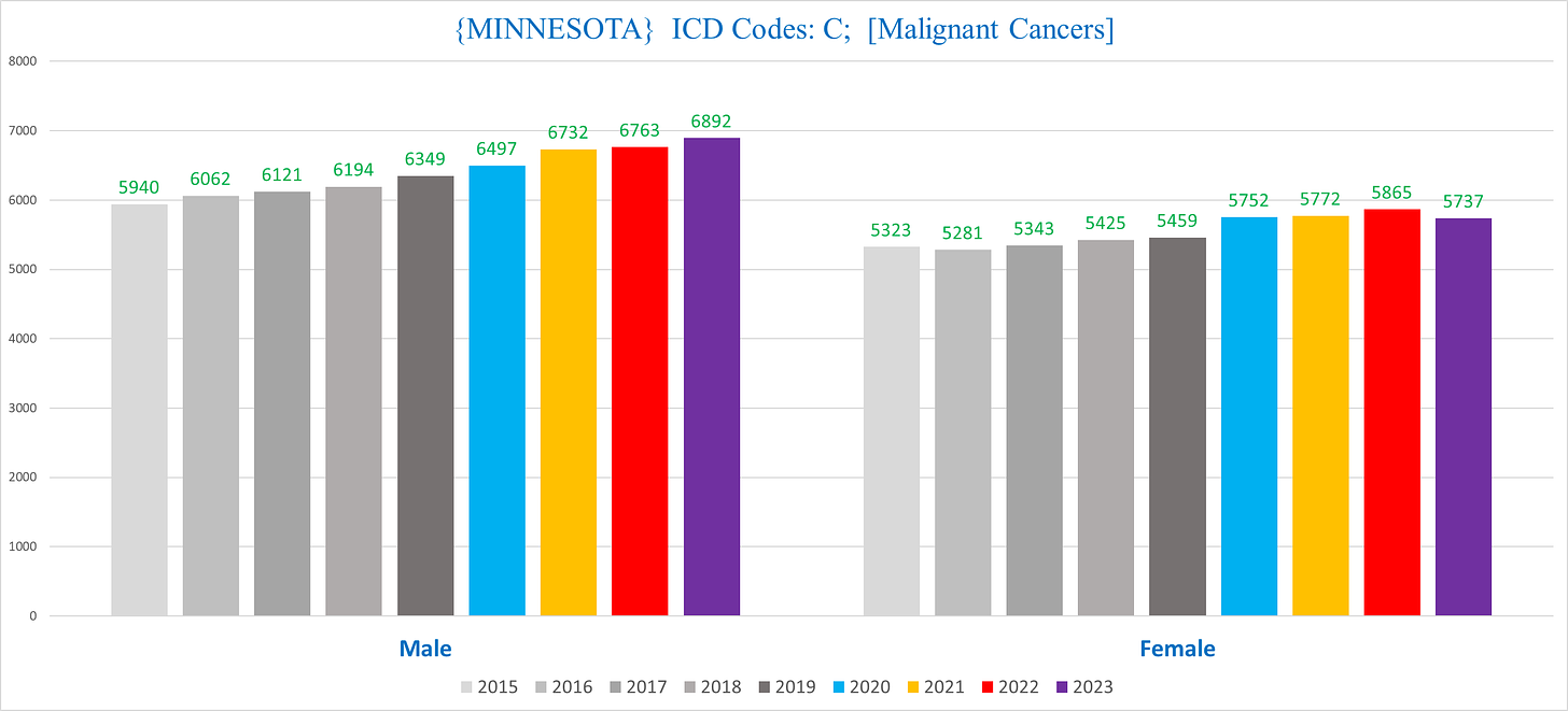
If we separate men and women, we see that the women had a flatter trend pre-pandemic with more pronounced excess during the pandemic years (2020-2023), although the 2023 total number of cancer deaths are lower than in 2022.
The men have a steeper rising trend pre-pandemic, but still are in excess, and notably unlike the women the 2023 total is higher than the 2022 total:
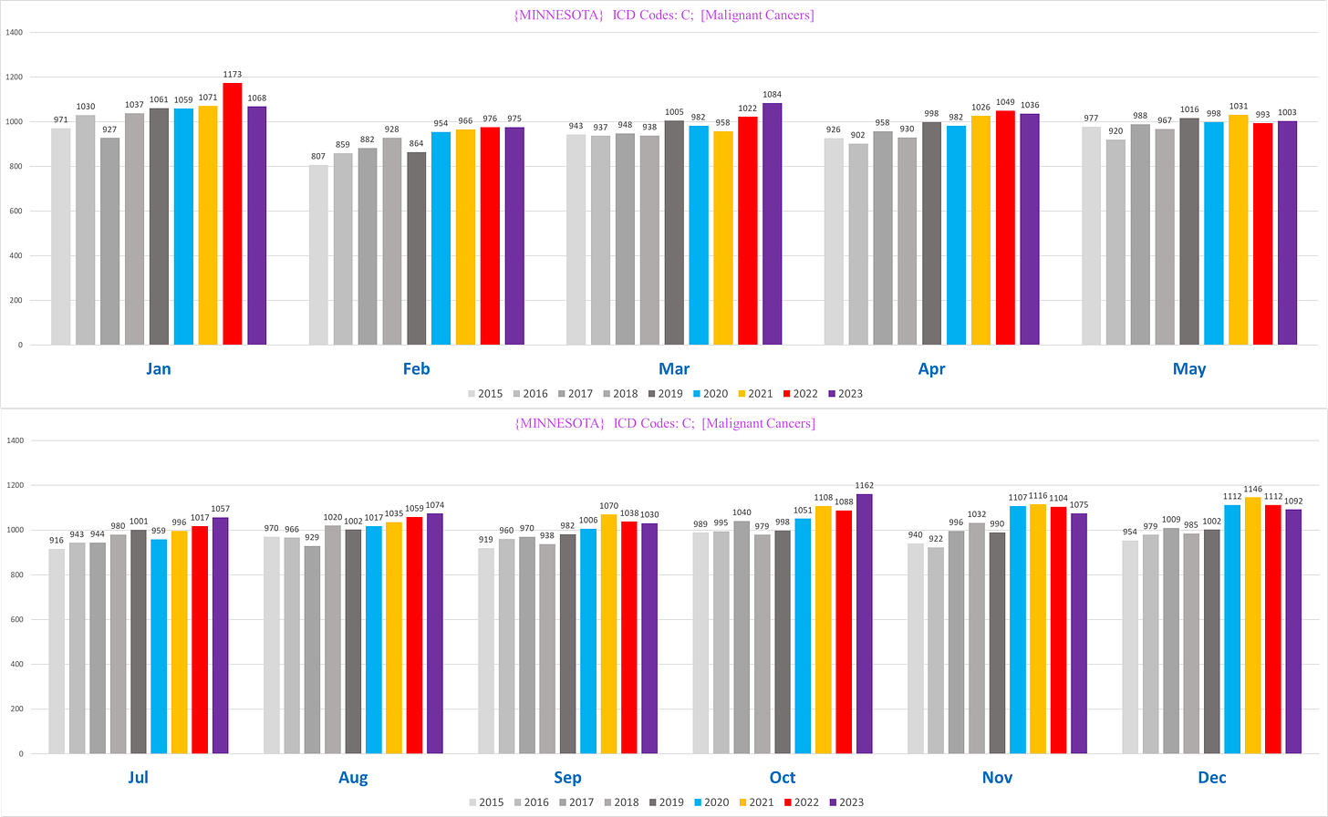
If we look at other characteristics, we see the same basic pattern, slight excess that is mostly unremarkable given the excess death in the population overall.
If this were the whole story, then it might stand to reason that cancer isn’t actually killing more people, because the slight excess can be explained by the fact that there is excess mortality in the state in the pandemic years from other reasons, which inevitably would tend to kill of some people with cancers who would have otherwise survived.
Of course, there is more to the story.
Nursing Home vs Non-Nursing Home
There is a major Simpson’s Paradox affecting the cancer mortality data driven by NH residents.
Minnesota helpfully identifies both the place of death and the type of residence before death, which is useful because it allows us to see NH residents who die elsewhere (mostly in a hospital), not just those who died on the NH grounds.
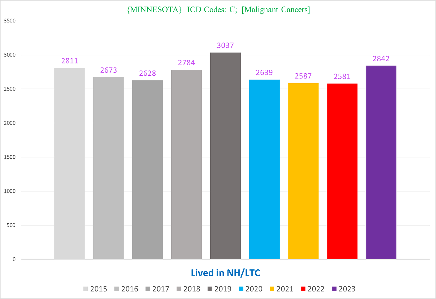
The following chart shows the number of cancer deaths of NH residents:
There’s not only a deficit post-2020, there’s also a deficit in 2020 too (!). This is probably a result of a mass culling of NH residents in the 2020 covid waves (covid + policies) - it is likely that some portion of these deaths would have been diagnosed with cancer and died shortly thereafter had they not been killed by covid first. Additionally, there were probably a lot of missed cancer diagnoses in NH residents who did die because Nursing Homes locked down more than any other sector of society - most of the services and healthcare normally provided for the residents was simply canceled.
Either way, there is a statistical cancer mortality deficit in NH residents for the pandemic years.
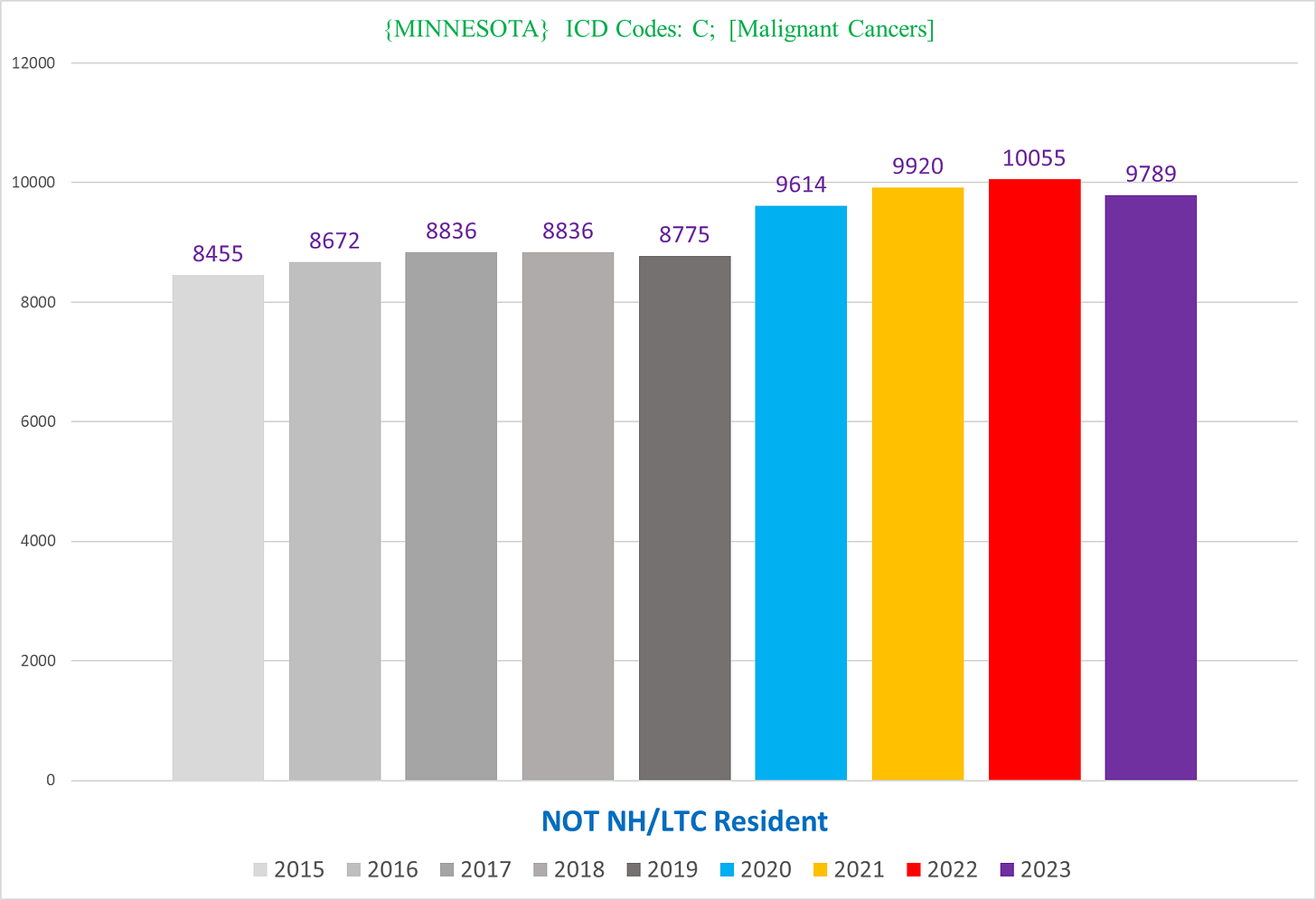
Now let’s look at cancer deaths in the non-NH residents:
Notice how the pre-pandemic trend is pretty flat, and there is a very sizable increase in all pandemic years.
(*Note: It is important to keep in mind that the NH population is dynamic rather than static, and it is possible that after 2020 people were a bit more reluctant to go to a NH after seeing the brutal carnage of covid policies in Nursing Homes. However, I don’t think that this can come close to explaining the entire discrepancy between NH vs non-NH residents.)
There’s a few thousand excess cancer deaths combined, or about 7%-10% excess depending on the year.
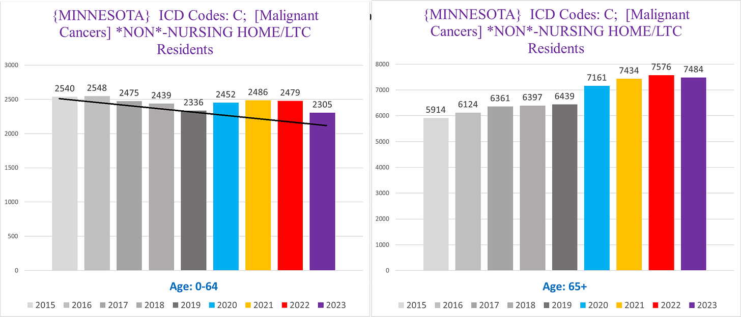
We can further disaggregate the non-NH resident cancer data to look at age. The following charts show the number of cancer deaths in Seniors (right) vs non-Seniors (left):
Again we can see a Simpson’s Paradox, where the non-seniors have a far more muted trend compared to the Seniors.
Furthermore, the trend of cancer deaths pre-pandemic are opposites between the non-seniors and seniors - whereas there is a clear downward trajectory for the non-seniors, there is an upward trajectory for the seniors
I added a black line to show approximately where the cancer deaths in the non-seniors should be for the pandemic years had the trend continued. Superficially, the portion of the bars above the black line is the excess above the trendline. In other words, it is likely that there is excess cancer deaths in the younger people even though the total numbers are actually lower than 2015/16 and about the same as 2017. However this might be very misleading because of a strange anomaly in the 50-59 age cohort which we’ll hopefully get to in a future article.
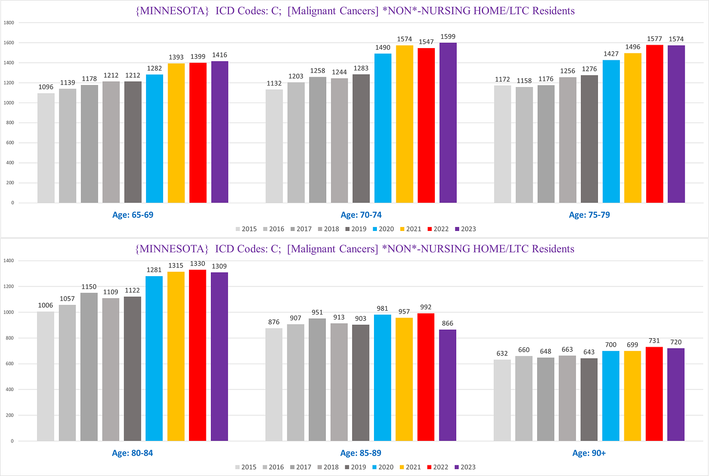
If we zoom in on the senior non-NH deaths, we can see that there is a big difference between the age cohorts 65-84, and 85+:
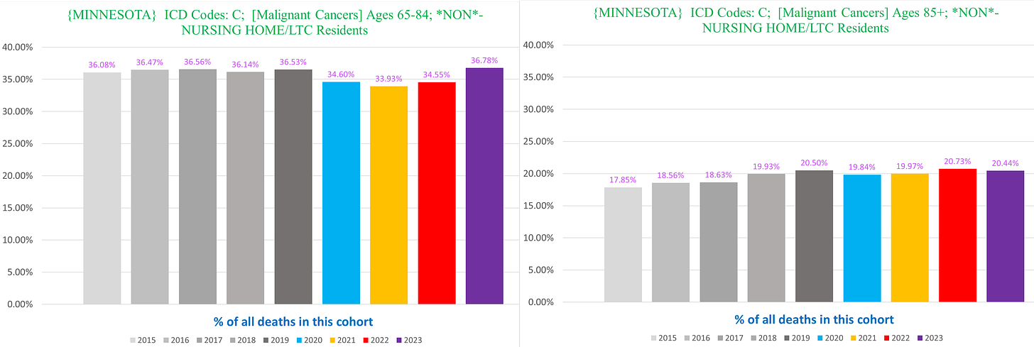
Firstly, cancers are a far smaller proportion of deaths in non-NH seniors 85+ (right) compared to non-NH seniors 65-84 (left):
Secondly, the smaller % of excess in the 85+ cohort might also be attributable at least in part to a pull-forward effect from the substantial excess mortality in that group in 2020.
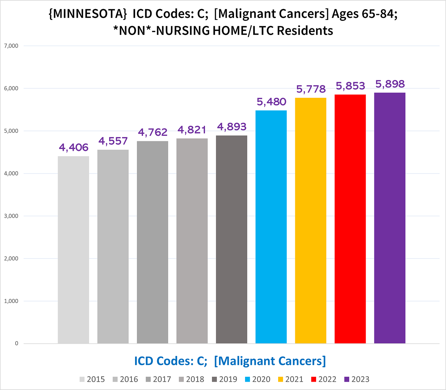
If we focus on the 65-84 cohort within the non-NH residents, we see the following:
Now this looks like a devastating trend - far clearer than the grand total of all cancer deaths that we started with:
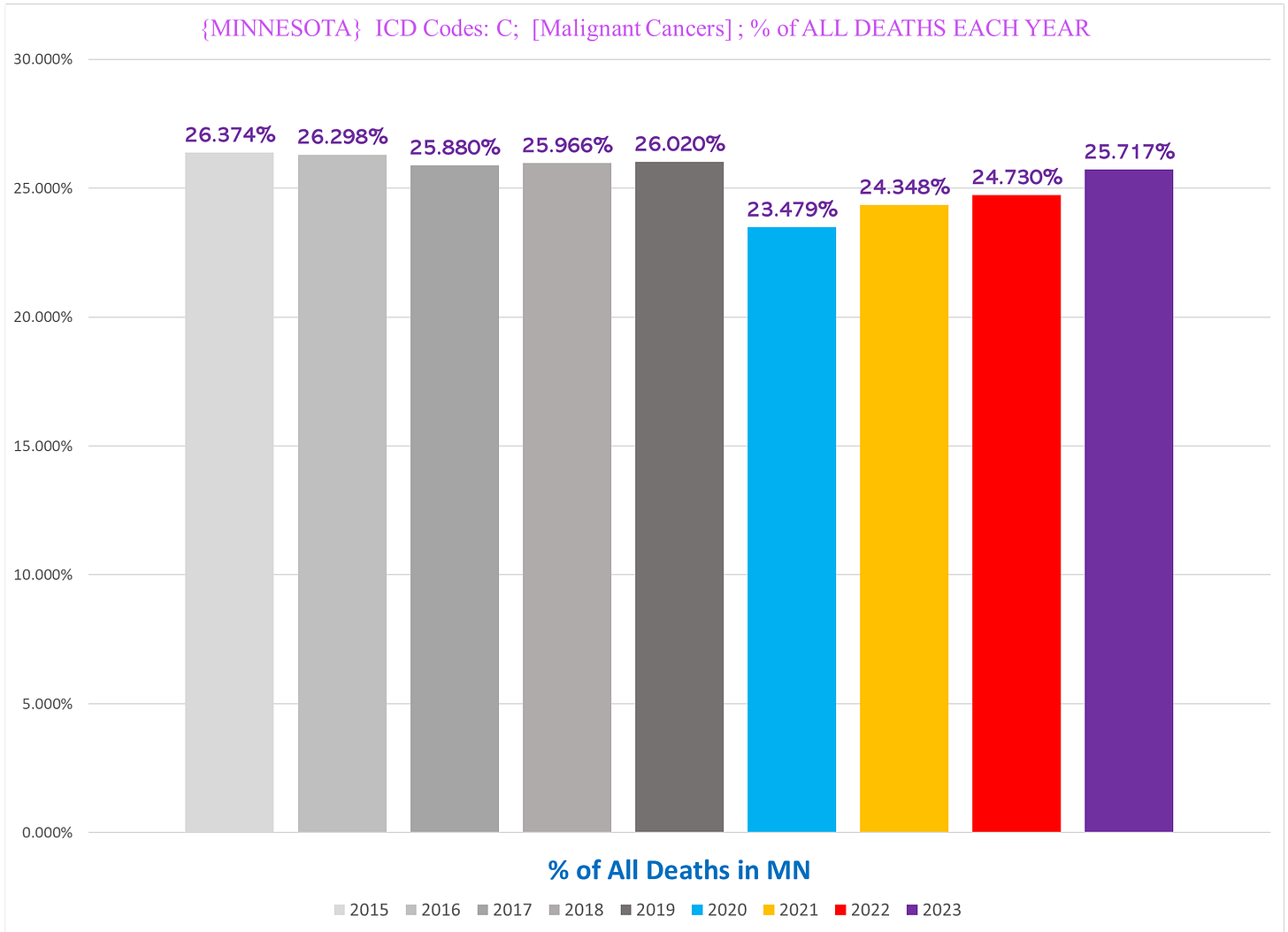
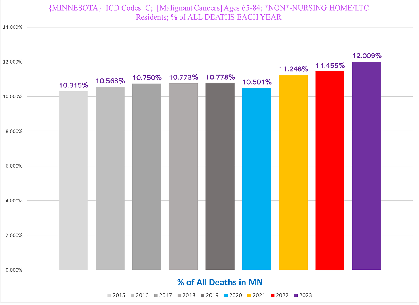
Another way to visualize the unique trend seen in the 65-84 yo non-NH residents is to look at cancer deaths as a % of all deaths each year in Minnesota.
The % of all deaths that involve a cancer actually decreases during all pandemic years -
- the % of all MN deaths that are a cancer death in the 65-84 year old non-NH resident seniors goes *UP* significantly, in 2021 but not 2020:
This is doubly impressive because these deaths comprise a larger portion of a pie that is itself larger because there is a lot of excess mortality from a variety of causes, not just cancer.
*******
Up next: UCoD vs MCoD, and looking at individual types of cancer



Solid stuff as always! Though I lightheartedly disagree with your point that ingrown toenails cannot plausibly contribute to a frail person's demise :)
If the vaccines were not introduced until 2021, and most people were not seeing their doctors or getting their checkups in 2020, then why did malignant cancers go up in 2020? I have my belief, but just wondering thoughts on this.